Creating a Dropdown Menu With Headless UI in React


Creating a website is no small feat. It requires careful planning, strategic design, and thoughtful implementation. And one of the most crucial elements of any website is its user interface (UI).
A website's interactive UI components serve as the gateway through which users interact with the site, and they play a critical role in shaping the user experience.
From dropdown menus to modals to tabs, UI components are essential in making websites more user-friendly and intuitive. But integrating these components is no easy task, since they also have to be fully accessible as well as have reusability and customisation options.
And that’s where Headless UI comes to the rescue.
Headless UI is an npm package that offers a practical solution to this problem. It enables you to build completely unstyled UI components that are fully accessible and easy to integrate into your website. It is created by Tailwind Labs who are also the creators of TailwindCSS.
By using Headless UI, you can focus more on styling your components with TailwindCSS and less on the functionality and accessibility side of things. This separates Headless UI from other, much more opinionated UI libraries such as Chakra and Bootstrap as the entire onus for styling is on the developer.
And based on that, we will be building a dropdown menu using Headless UI and TailwindCSS in this blog.
Let’s start.
Setting Up the Dev Environment
When you want to use TailwindCSS inside a React app, you must first set it up and configure it.
First, create a React app by running the command:
Next, install TailwindCSS and other dependencies like postcss and autoprefixer using the command:
Create config files by running the command:
Now open the tailwind.config.css file and replace the content with the provided code snippet.
Paste the following code snippet inside the src/index.css file:
You can now use TailwindCSS in your React app.
Installing Headless UI is relatively simple; just run this command and then you can use it anywhere inside your React app.
Creating a Traditional Dropdown Menu
While creating a basic dropdown menu is a relatively straightforward task, it can become cumbersome and keep you from implementing much more important features.
To create a functional dropdown menu, you have to write about 20 lines of code as shown above.
And even with that, it often lacks critical functionalities in terms of accessibility and user experience. For example, you may not be able to click outside the panel to close the dropdown or navigate using keyboard keys.
For that, you can add multiple lines of code to address these issues but it can be time-consuming and tedious. That's where UI libraries like Headless UI can be incredibly helpful as they provide pre-built components that offer accessibility and navigation support.
Creating a Customisable Dropdown Menu with Headless UI
When using Headless UI for a dropdown menu, it's important to understand the basic concepts.
There are four primary components: "Menu", "Menu.Button", "Menu.Items", and "Menu.Item". As the names suggest, the "Menu" component contains everything, the "Menu.Button" is essentially a button, and the "Menu.Items" component contains multiple "Menu.Item" components.
This concept of components composition is the cornerstone of Headless UI and you will see this pattern repeat for other UI components such as popovers and dialogs.
With that said, here is the basic code based on the official documentation.
In the code snippet, the “active” property is used as an argument to the function.
When "active" is true, the className property of the "a" element will be set to "bg-blue-500", giving it a blue background color. Conversely, when "active" is false, the className property will be set to an empty string, removing the background color.
Also, this code provides improved functionality for instance allowing users to navigate the dropdown menu using their keyboard, closing the dropdown by clicking outside, and many more.
Now that we have a functional dropdown menu, it's time to add some styling. Since we have installed TailwindCSS, we can use it to add style to our menu.
Here is the output:

The customisability doesn't stop here - Headless UI also allows you to further tailor the functionality of your dropdown menu. For example, you can manually control when the menu opens and closes by passing the `open` and` close` props to the relevant components.
For instance, you can check the code below which uses the `open` and` close` props.
And there are more such components API that Headless UI provides.
With these powerful features, you can create a truly bespoke dropdown menu that meets all of your unique requirements.
Unleashing the Power of Headless UI
Speaking about integration, Headless UI can be easily integrated into React and Next.js applications. And you can seamlessly add styles to your components with TailwindCSS as well.
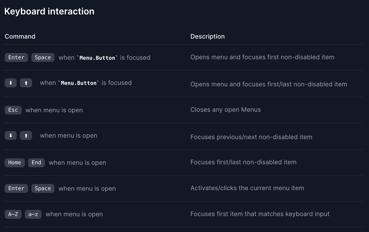
Another key benefit of using Headless UI is its excellent accessibility features like focus management, mouse interaction, and keyboard interaction.

Also, the library has taken care of all relevant ARIA attributes and provided several other props like "active", "open", "close", "as", "unmount", and many more, to help you further customize the components as per your needs.
So, whether you want to build a simple dropdown menu or a more complex UI component, Headless UI provides all the necessary functionality and accessibility features to make your development process easier and more efficient.
While Headless UI is great for building accessible UI components that work out-of-the-box and integrate seamlessly with TailwindCSS, you still need a responsive React codebase with TailwindCSS to get started.
You can generate responsive code directly from your design files using the Locofy.ai plugin.
Locofy automatically picks up your Figma auto layout settings and constraints to generate responsive code with flex properties. Additionally, you can choose to use TailwindCSS as the default styling option as well so your Locofy.ai generated code will utilise TailwindCSS for handling styles.
You can then use these Headless UI components to incorporate accessible drop downs, auto-complete, tabs, and other such components.
If you want to learn more about how to convert your Figma design to React, React Native, HTML/CSS, Nextjs, Vue, and more, check out our docs. Or explore our solution pages for an in-depth look at how Locofy helps you build apps, websites, portfolio pages and responsive prototypes effortlessly using our low-code platform with seamless AI code generation.
