How To Get Started With Chakra UI & Extend the Theme


When it comes to building modern, responsive, and user-friendly web applications, choosing the right CSS framework is crucial. Bootstrap, Material-UI, TailwindCSS, and Chakra UI are popular options, but each has unique features and benefits.
Chakra UI, in particular, is a modern UI library for React that provides a clean, accessible, and easy-to-use set of components and design patterns. But what sets Chakra UI apart from other CSS frameworks is its focus on accessibility and its ability to provide a customised and flexible theme system.
With Chakra UI, developers can build accessible, visually appealing, and responsive web applications that meet the needs of a wide range of users. The library's components are designed to be used together in a harmonious way, ensuring that the overall look and feel of your web application remains consistent and cohesive.
Also, Chakra UI's theme system allows developers to easily customise their components to match their brand or design style.
Let’s take a deep dive into Chakra UI and explore all of the features it has to offer and how it can server as a custom design system for your projects.
Installing Chakra UI for Your React Project
Chakra UI is easy to integrate into your React project.
If you have a React project and wish to install Chakra UI, use the following command:
Then, you have to wrap your App like this.
You can also use the below command to install Chakra UI by setting up a new React project.
For JavaScript:
For TypeScript:
That's all.
You can now use Chakra UI within your React project.
Creating a Basic Navbar Design
The header section is typically the first thing that users will see when they visit your website, so it is important to make it visually appealing and easy to navigate.
Here is an example of how to create a basic header section using Chakra UI:
Here, we have defined a React functional component that represents a navigation bar with a header, a toggle button, a list of links, and a sign-in button. The navigation bar is styled using the Chakra UI library and its components such as Flex, Box, Heading, Link, and Button.
The component uses React state to manage the visibility of the links and the sign-in button on smaller screens. When the toggle button is clicked, the handleToggle function updates the state of the "show" variable using setShow to show or hide the links and the sign-in button.
The component is structured using the Chakra UI Flex component to arrange the header, the toggle button, the links, and the sign-in button in a row with a defined background color and text color. On larger screens, the links and sign-in buttons are always visible. On smaller screens, the links and sign-in buttons are hidden by default and can be shown by clicking the toggle button.
You can similarly create a captivating hero section, an informative blog section, a functional form, and, with all these, a complete website by using these Chakra UI components as the building blocks.
Exploring the Chakra Design System
Material UI, as we know, adheres to Google's Material Design Guidelines, which provide a uniform design language for web applications. Chakra UI, on the other hand, is dedicated to offering a simple, modular, and user-friendly design framework for developing online applications.
The design system provides a set of rules for developers to follow while building interfaces, ensuring that the components are consistent and accessible to all users.
The design system consists of several key aspects, including typeface, colors, space, and icons. These components are easily customizable to match your brand and design style, allowing you to easily create a one-of-a-kind look and feel for your application.
According to the documentation, below are some of the design principles.
- Customizable Styles: The appearance of components can be altered or enhanced through style props, reducing the reliance on the CSS prop or styled-components.
- Intuitive API: Keep the component API as straightforward as possible and demonstrate practical uses for the component.
- Modular Structure: Divide components into smaller, more manageable pieces with minimal props. This approach will allow for greater flexibility and scalability in terms of both functionality and appearance.
- Accessibility Considerations: When developing a component, prioritize accessibility, including keyboard navigation, focus management, and the use of appropriate aria-* attributes. Ensure proper color contrast for enhanced readability and compatibility with voice-over technology.
- Dark Mode Support: Components should be designed to accommodate dark mode, utilizing the useColorMode hook to handle styling. Learn more about implementing dark mode.
- Clear Prop Naming: Prop names should clearly indicate their purpose. Boolean props should be named using auxiliary verbs, such as "is" or "does." For example, the Button component uses "isDisabled" or "isLoading."
Extending the Default Theme
One of the great things about Chakra UI is that it provides a powerful and flexible theme system. You can easily extend the default theme to match your brand and design style.
This allows you to set your brand colors, fonts, and other such base styles as the default, global style. This truly makes the Chakra UI feel as if it was created for your personal use.
Chakra UI’s default theme can easily be extended by passing in a JSON object with keys such as fonts, colors, and line heights, and even defining different variants.
To extend the default theme, you can create a new theme.js file in your project and add the following code:
In this example, we are extending the default theme by defining new values for the font, colors, and sizes properties.
As you can see from the code snippet above, we can define a custom background, text, and card color as well as the default font families for different text types such as heading and body.
We can now import this custom theme into our application and use it in our components.
In this example, we are using the ChakraProvider component from Chakra UI to wrap our entire application and pass it into our custom theme. This will ensure that all the components within our application use the custom theme we defined.
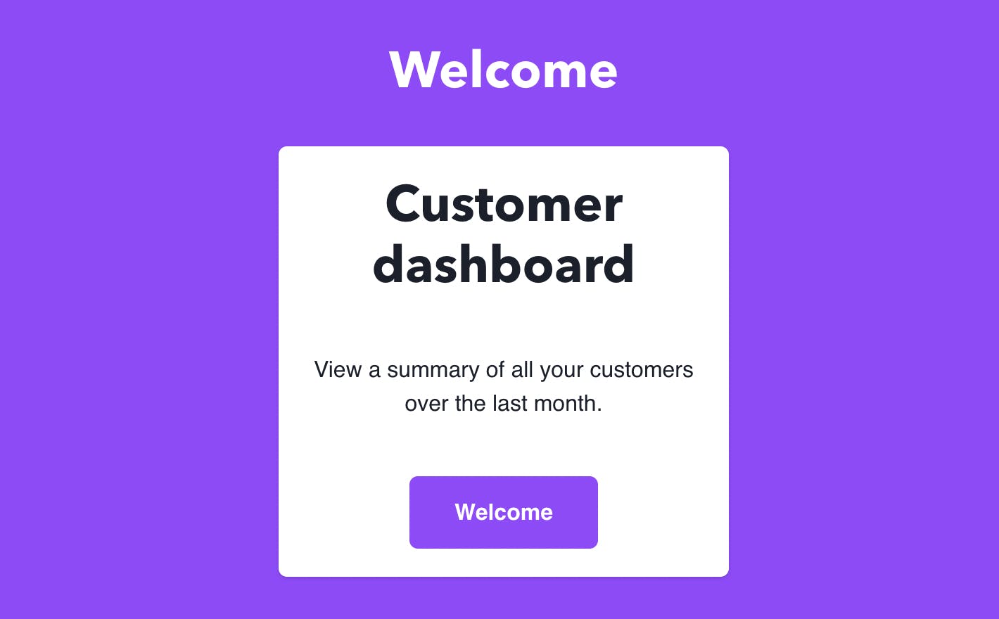
Here is the output:

You can see the custom theme we created above in action. Our background & card colors have inherited the values from the custom theme and this makes us easily create more components as well adhering to our personal theme.
How to Quickly Integrate Chakra UI in Your React Project?
Apps requiring a comprehensive design system customizable for your particular needs can make great use of the Chakra UI.
As we know, Chakra UI offers a range of responsive and reusable components, allowing you to build complex UI elements with ease. It also prioritizes accessibility and is built with ARIA attributes and keyboard interactions in mind, making it an ideal choice for projects that need to be accessible to all users.
However, one of the biggest challenges developers face during the developer handoff process is replicating the designs in code and it can be even harder to do so with any UI library because often the library limits the customization possibilities that the designer may have in mind.
This is where Locofy.ai comes in. It will allow designers to not hand over static design files but rather live, responsive code that is highly extensible as well.
Locofy.ai is essentially a Figma and Adobe XD plugin that can not only convert your designs to pixel-perfect React code but also enable you to tag your design components with Chakra UI elements.
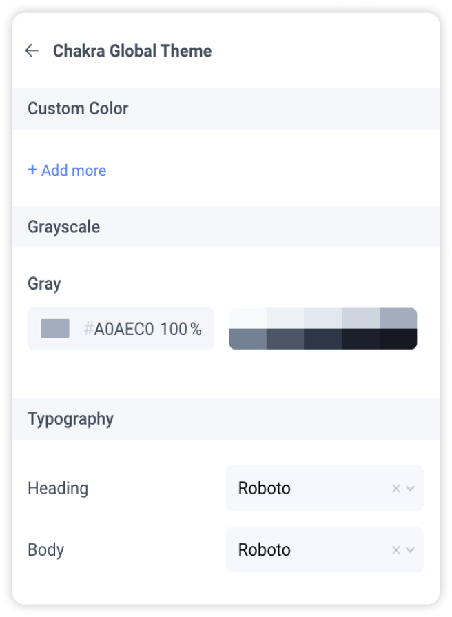
This ensures that when you export the code, it is using the right Chakra UI components under the hood. You can also create a custom Chakra UI theme directly from your design files.

Moreover, the plugin also uses AI to assist you in breaking down your code into components with value props for easier code extension.
In other words, you can go from Figma to production-ready React code with Chakra UI integrated out-of-the-box in record time and ship products 5-10x faster.
If you want to learn more about how to convert your Figma design to React, React Native, HTML/CSS, Nextjs, Vue, and more, check out our docs. Or explore our solution pages for an in-depth look at how Locofy helps you build apps, websites, portfolio pages and responsive prototypes effortlessly using our low-code platform with seamless AI code generation.
