Auto Layout to Build Responsive Code
Learn how to convert your designs into responsive code using Figma and Locofy.ai.
This guide will help you understand auto layout, its benefits and how to use it to create responsive designs faster.
What is Auto Layout?
Auto layout is a powerful setting in Figma that you can apply to Frames to create designs that respond to changes in layout size and changes in content.
With auto layout, you can create a user interface that dynamically adapts to all the screen sizes, without needing to manually set the size and position for every possible size. On top of that, it can adapt to content changes as well.
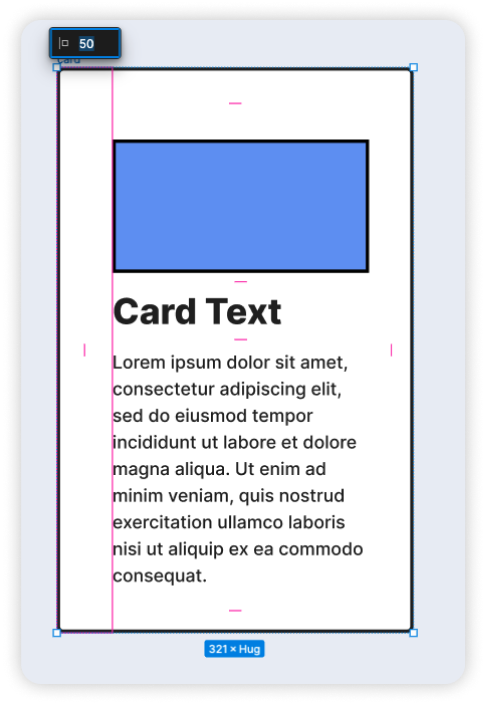
For example, the card above may be populated with data from your database. We want to make sure it looks great regardless if the data has text that spans 3 lines, 4 lines or more. You can do this easily with auto layout.
In code terms, auto layout corresponds to Flexbox in CSS. You will also see this in action when you export the code using Locofy.
You can use several properties to customise auto layout. Some of the basic properties are:
Layout direction
Layout direction is the most basic property for auto layout. Inside an auto layout frame, all elements can be arranged in a horizontal, vertical or wrap layout direction.
In this example, we have a simple navigation bar. It's a frame with some elements inside. This auto layout frame is in a vertical direction, and we can easily switch this to a horizontal orientation by toggling the direction property.
The auto layout frame now has wrap enabled, and the elements will automatically wrap to the next line when they reach the maximum width set on their parent container. This ensures that the elements within the container maintain their layout and do not overflow beyond the container's boundaries.
Padding

Padding helps you to add some space between the frame and the child layers. You can adjust the padding by dragging the pink handles in the canvas or by editing the values in the settings panel.
When applying auto layout to your design, you may notice some movement in your design. This is because Figma tries to calculate the padding values to set for your auto layout frame. Figma attempts to keep the top and bottom padding equal. And the left and right padding equal.
In case you want to maintain the look of your original design, you can simply edit the padding to maintain the space between the elements and the frame. Alternatively, you can stretch the width and height of your frame to restore it to the original design.
Alignment

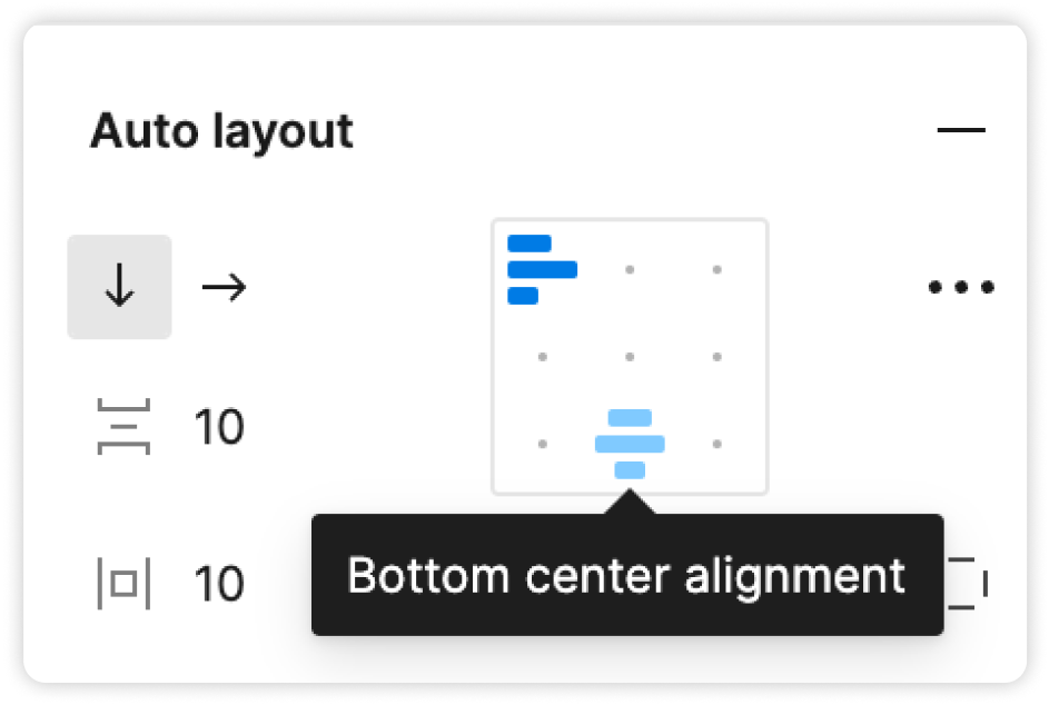
Alignment is very intuitive and can be visually understood by looking at this box shown above, which is present inside the auto layout panel on the left side. It helps you to keep your designs neat and consistent. There are two things to note:
Firstly, as you change the alignment of your items, padding is still respected. So if you have your elements aligned towards the right, they will move all the way right, but not into the right-padding of the auto layout frame.
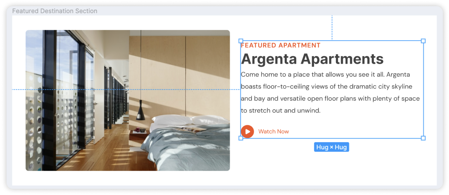
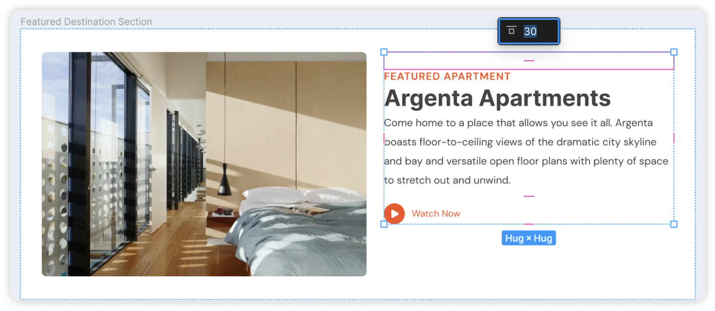
Secondly, in an auto layout frame, all items must follow the same alignment. In the example below, this element is not quite top aligned, but not centre aligned either.

To handle this, you can simply add another auto layout frame around this group of elements, and apply padding to it. Now when we apply auto-layout to the outer frame, this element maintains its distance from the top.

The space between items property of an auto layout frame helps to define the gap between its children elements. You can adjust the spacing by dragging the pink handle in the canvas itself, or by editing the value in the settings panel.

Note that in an auto layout frame, the space between the child elements are always equal. You cannot have different spaces between the items. If you have a layout that requires different spaces, you may need to use multiple auto layout frames.
For example, we can have a navigation bar with the icon on the left, and menu links on the right. If we directly apply auto layout, all the items will be evenly spaced.

To handle this easily, we can simply apply auto layout to the links first, since they already have an equal spacing. Then we can apply auto layout to the frame. There will now be an equal spacing between all items for this auto layout frame.
Absolute in Auto Layout
Elements in an auto layout frame are arranged vertically, or horizontally with constant spacing between them. For floating design elements you can use the absolute property in auto layout setting, this allows the element's position to be fixed within its container, regardless of the layout direction.
In this example, we have a frame with some content that we want to arrange vertically, which is quite straightforward with auto layout. However, you'll see that the floating design element is included as part of the arrangement as well.
You can handle this with a few simple steps:
-
Remove the floating element from the frame.
-
You can then bring the floating element back in the frame. And click the "Absolute Position" button. You can now move this anywhere you want in the frame.You can also set its constraints to define how it should be positioned as the frame resizes.
This is how you can easily apply auto layout to frames that contain floating elements.
Applying Responsive Constraints
Once you've applied auto layout to your designs, you're just one step away from making your designs responsive. Here are the settings you can apply.
Fill Container
Fill container setting lets your child elements resize according to the size of the parent.
In this example, we have an auto layout frame with elements inside. As we stretch the frame, you'll notice that the elements inside remain static. That's because these elements have a fixed width setting. If we want this element to also resize along with the parent, we can set its width to "Fill container" setting. You'll see that it now takes up all the available space in its parent.
And as we continue to adjust the size of the parent, the element resizes accordingly. If we open the Locofy plugin and check out the preview that runs on live code, you'll see that it produces the same behaviour.
Do note that the "Fill Container" setting only appears when the parent is an auto layout frame. If the parent is a group or a frame, the "Fill Container" setting will not be available.
Hug Contents
Hug contents lets your parent frame respond to changes in the size of its children. Typically when you resize the width of your parent frame, you'll want the width of its child elements to resize as well.
This may cause the height of its child element to increase, and sometimes, it may overflow out of the parent container. You'll notice the same behaviour on the Locofy preview running on live code. This is because the height of the container is fixed. If we want the parent height to respond to it's children, you can instead set the height to "Hug contents"
Now you'll see that it adjusts as the child grows in height. Once again this is reflected in the Locofy preview. If you notice that you've set the parent container to "Hug contents" but it doesn't seem to be resize accordingly, do check if the inner elements also have "Hug contents" applied to them.
Space between
To make your designs responsive, one option is to have the child elements resize along with the parent frame.
This can be achieved through using the "Fill Container" setting covered in the previous segment. Another option is for the space to resize along with the parent frame. Typically when you apply auto layout, you'll find that a constant spacing is applied between each element.
This remains a fixed value when you stretch or shrink the parent frame. If you want the spaces to resize along with the parent, you can apply the "Space between" setting by clicking the 3 dots as shown below, and change the spacing mode from packed, to space between.
You'll notice that the value for spacing is now "Auto" which means that it expands to fill all available space as the parent resizes. Again, this is reflected accordingly in the Locofy plugin preview that runs on live code.
With that, we’ve covered all the basics you need to know to get started with Figma’s auto layout feature.