Creating a custom button
Learn how to create a custom button with best design practices. Then tag it and apply hover effects and actions.
-
Draw a button by creating a frame and applying styling to it
-
Then add your text inside of the frame
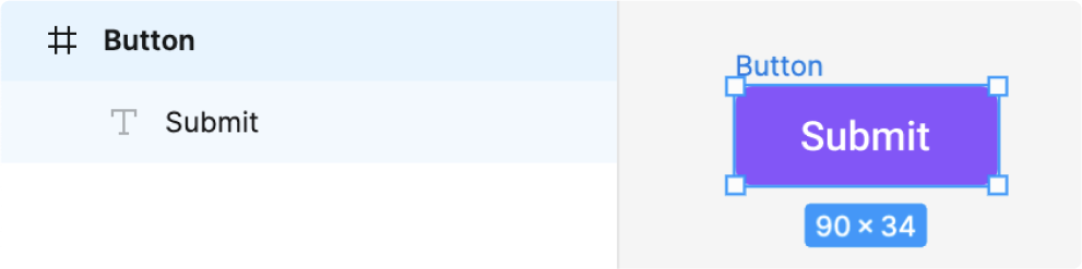

Note: Avoid using a rectangle with text on top of it as this creates uneccesary lines of code during code generation.
Tag, add hover effects and actions
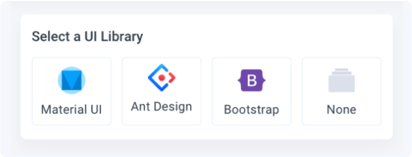
- Select the button frame and tag it as a button. For custom buttons, select “none” for the UI library
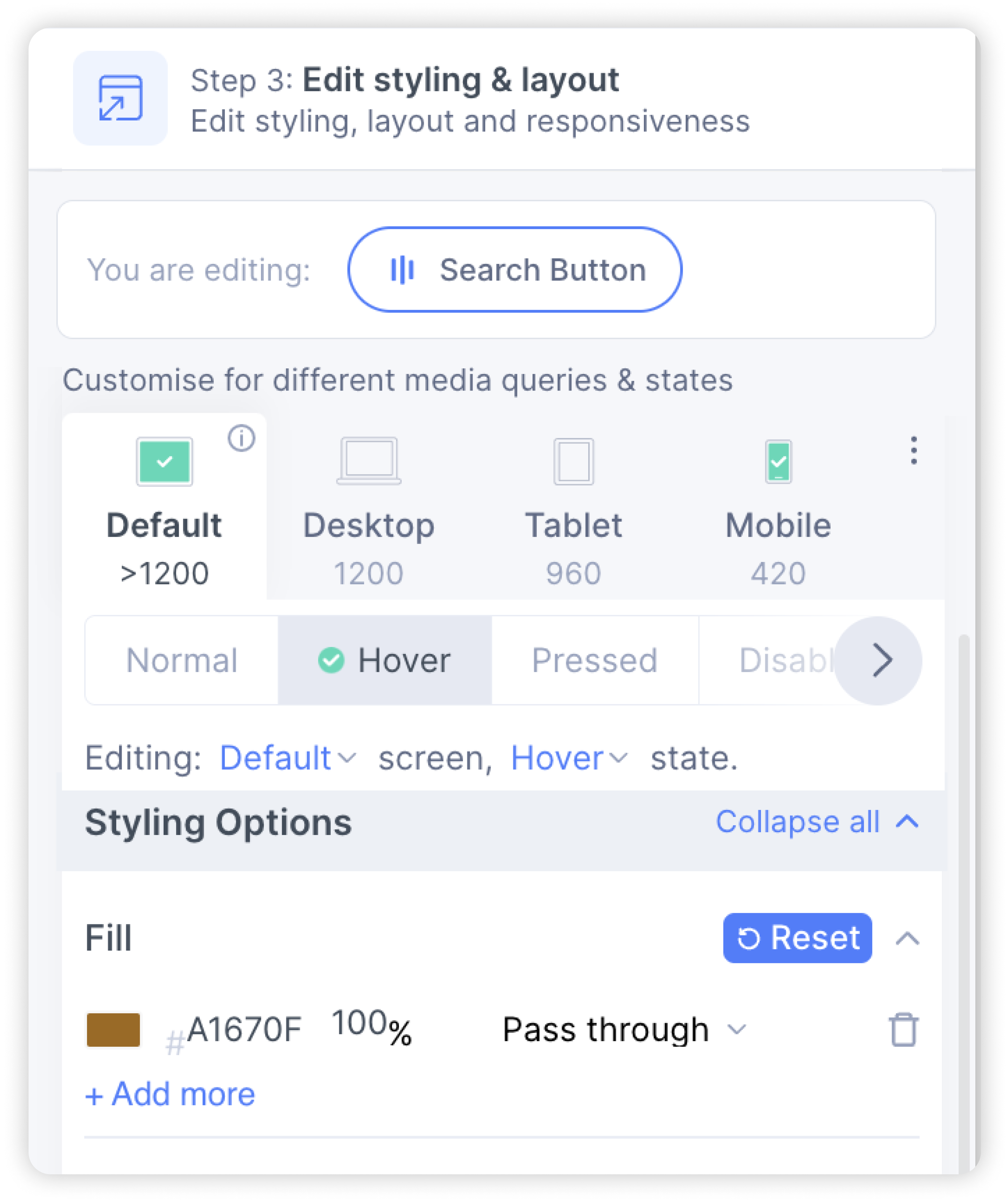
- In the Styling & Layout settings, click the “hover” tab and change the fill colour.
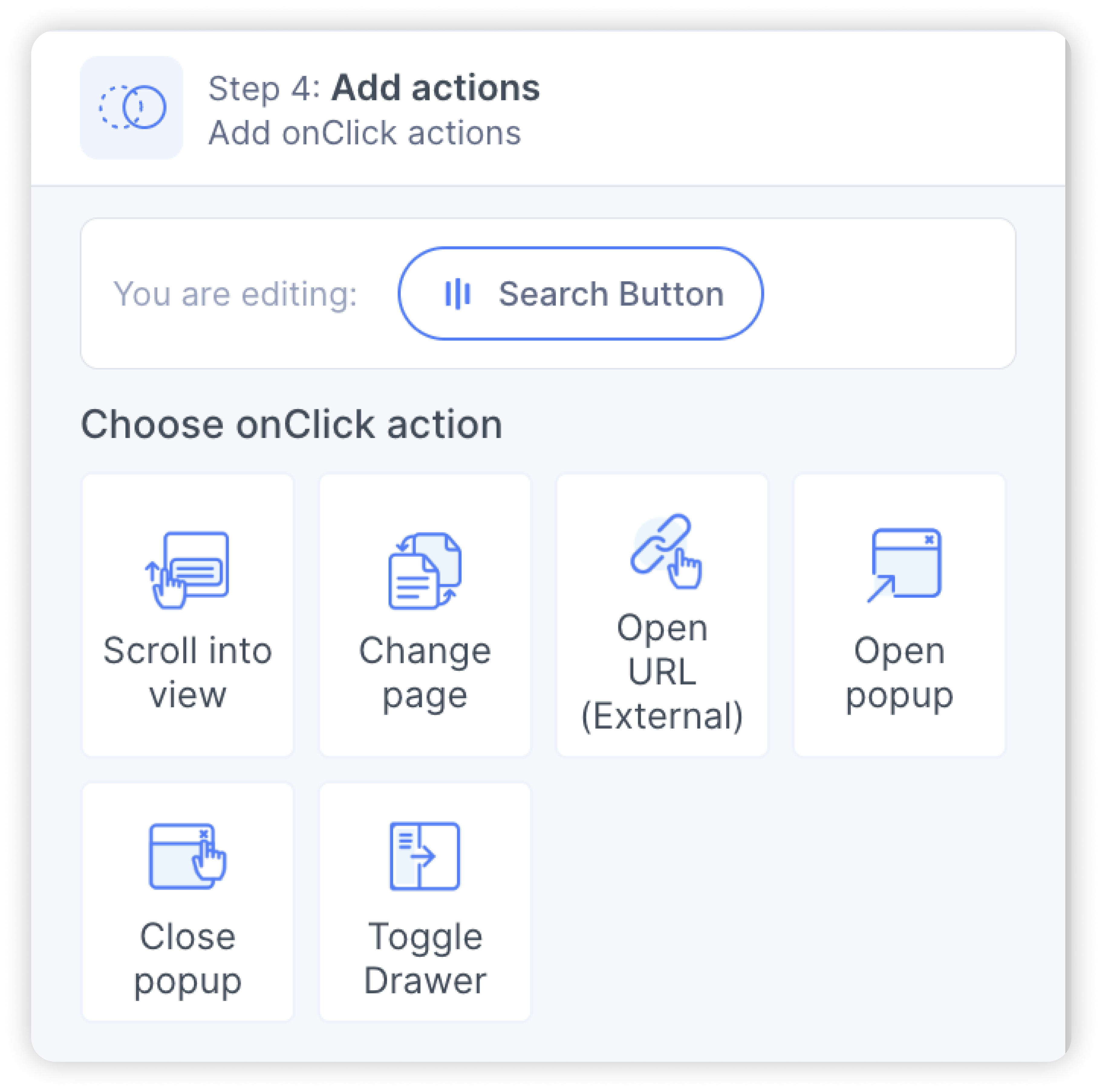
- In the Actions settings, you can choose an action to be taken when the button is clicked.
- You have successfully created a custom button