Tagging elements on your React Native Project
Learn how to tag the various elements on your mobile app design for your React Native app. Follow along as we convert this Figma design into a React Native Travel App
It is easy to use Locofy to turn your mobile app design to code. You can do so by tagging your elements to turn them into working live components.
Types of Tags for React Native
Global Tags
These tags are for global elements that are across all screens

Other Tags
These tags are available for individual screens
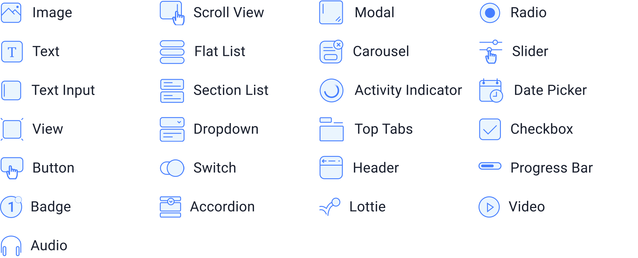
Tagging your Buttons
In this guide, you’ll see examples of tagging for common items that you’ll find in most mobile apps
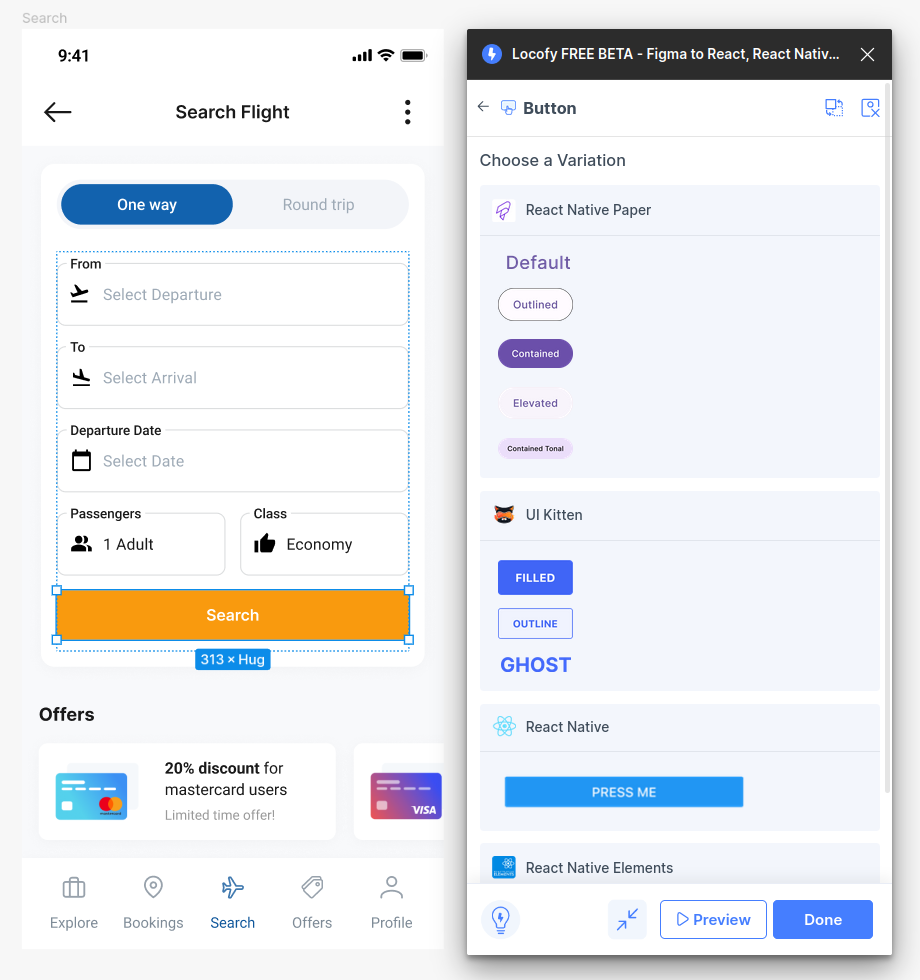
- Select the button on your design and tag it as a “Button.” Afterward, click on the library and variation you used in your design.
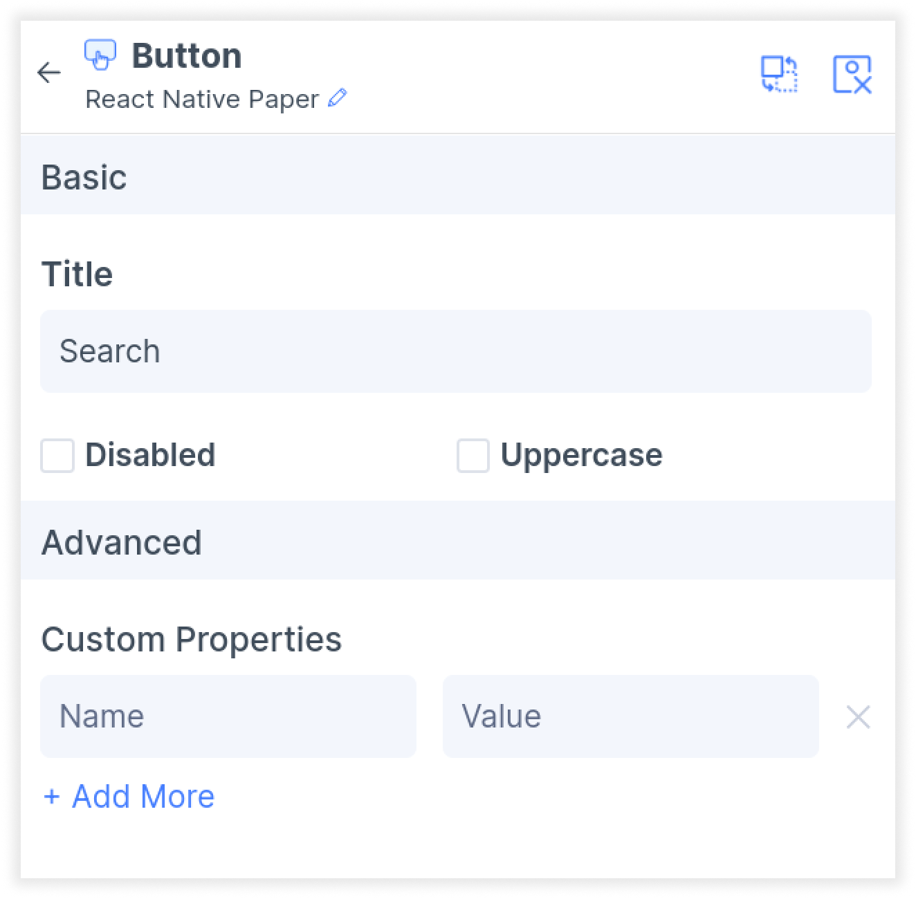
- In the Properties tab, you can further customize the attributes for your button.
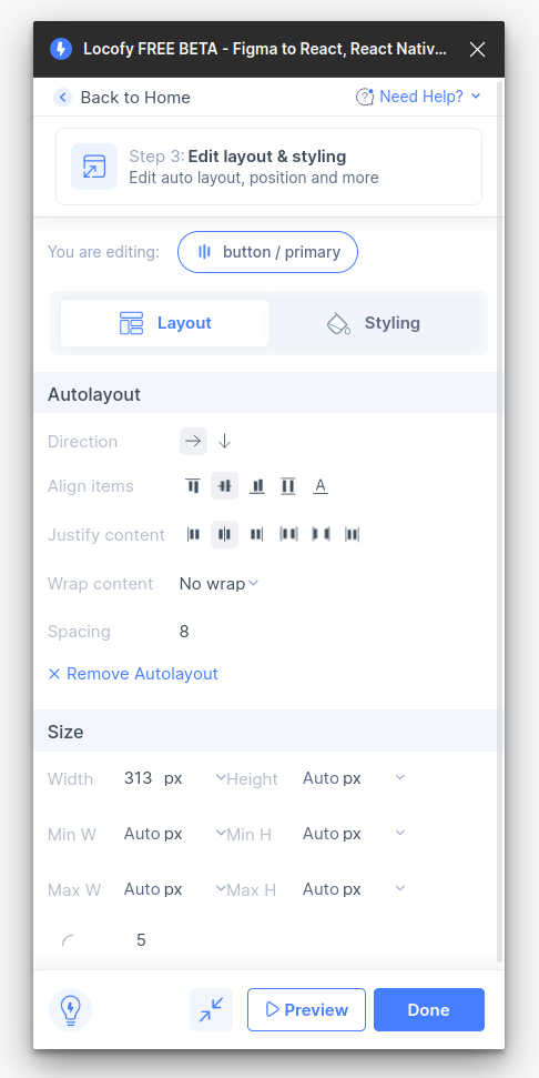
- Next, in the Layout settings under Step 3: Styling and Layout (opens in a new tab) of the plugin, you can customize alignment and size, including settings such as percentage widths, as well as minimum and maximum width.
- Then, in the styling tab, you can further customize your button’s color, border and shadow.
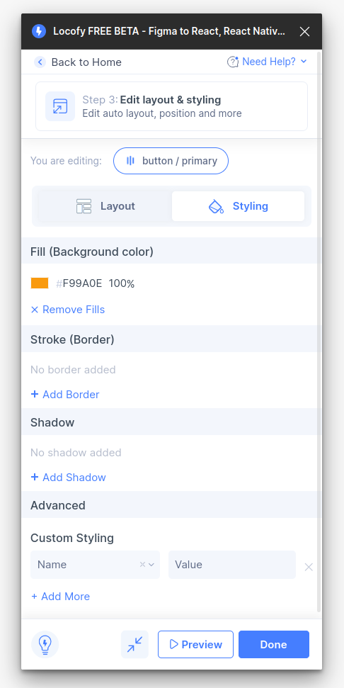
- Finally, in the actions tab Step 4: Add Actions (opens in a new tab) of the plugin, you can define what happens when a user presses the button. Select from triggers such as “Press” and “Long Press,” and choose an action.
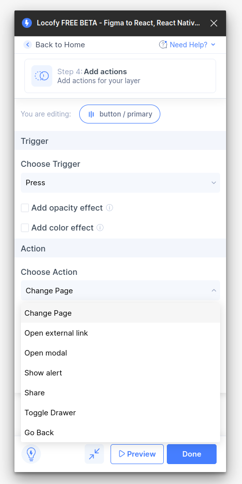
- Click done. You have successfully tagged your React Native button.
Tagging your Input
- Select the input frame on your design and tag it as an “Input”. Then, select the library and variation which you used in your design.
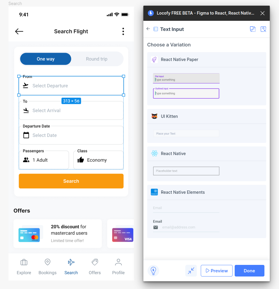
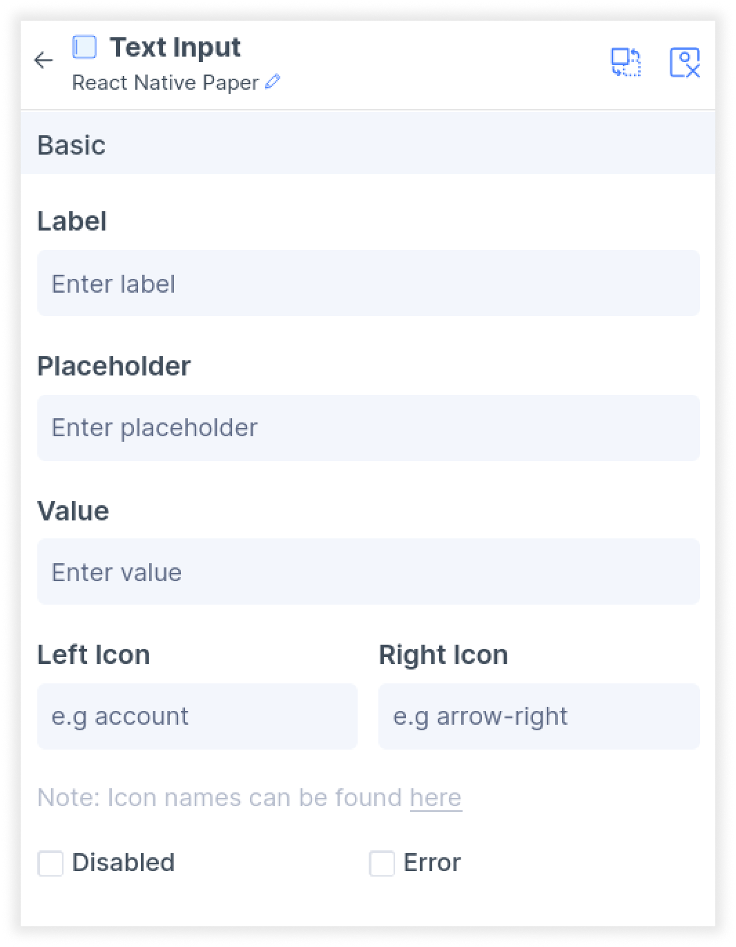
- In the Properties settings, further customize the attributes for your input. For libraries such as React Native Paper, you add icons and choose from over 1000 material icons by clicking on the link below the icon section.
- Next, in the Layout settings under Step 3: Styling and Layout (opens in a new tab) of the plugin, you can customize alignment and size, including settings such as percentage widths, as well as minimum and maximum width.
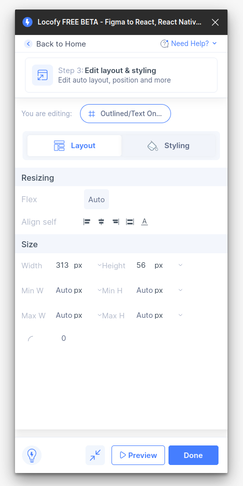
- Then, in the styling tab, you can set up active and inactive colour, along with other settings such as typography.
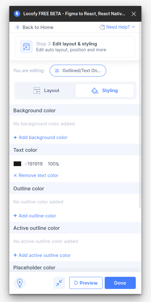
- Click done. You have successfully tagged your text input
Tagging your Bottom Tabs, Drawer Menus and Top Tabs
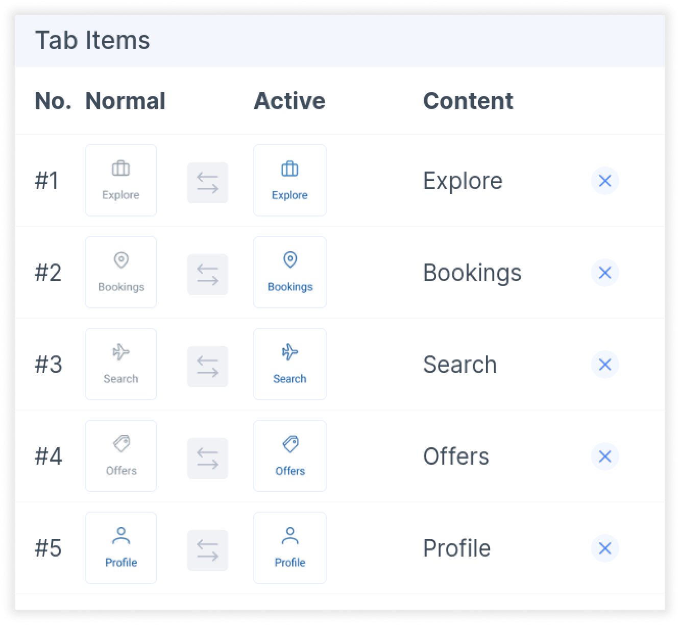
These tags have very similar workflows. You will need to identify the designs for the active and inactive state for each tab/menu item, as well as the content you want to show.
-
Select the element on your canvas and tag is correspondingly as a “Bottom Tab”, “Drawer Menu” or “Top Tab”
-
In the properties page, you’ll notice that some of the icons are automatically detected based on your selection. Use the swap button if you need to swap your active and normal state icons
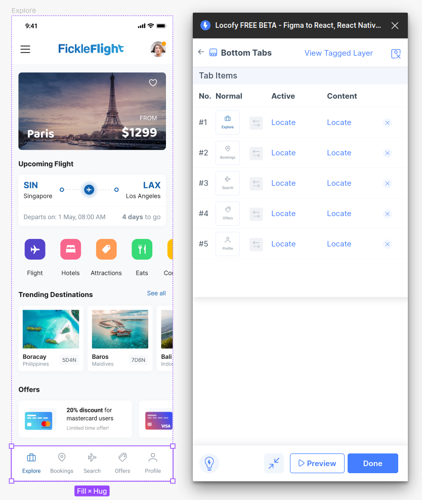
- You will need to select and locate the correct layer on Figma for each of your Active and Normal state icons.
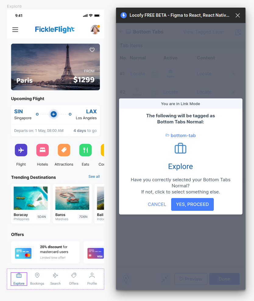
- Then, you will need to indicate the Figma frame to show for each of the tabs. Press locate and select the frame you want to display for each respective tab.
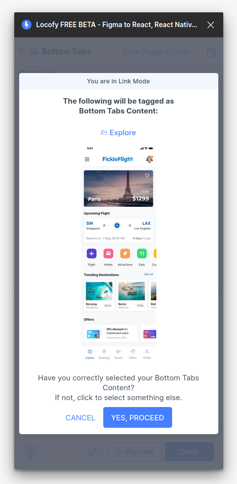
- Once all of the tabs have been configured, click done. You have successfully tagged your Bottom tab, Drawer menu, or Top Tab.
To view specific guides for each of the tags, you can follow these links:
Tagging your Scroll Views
-
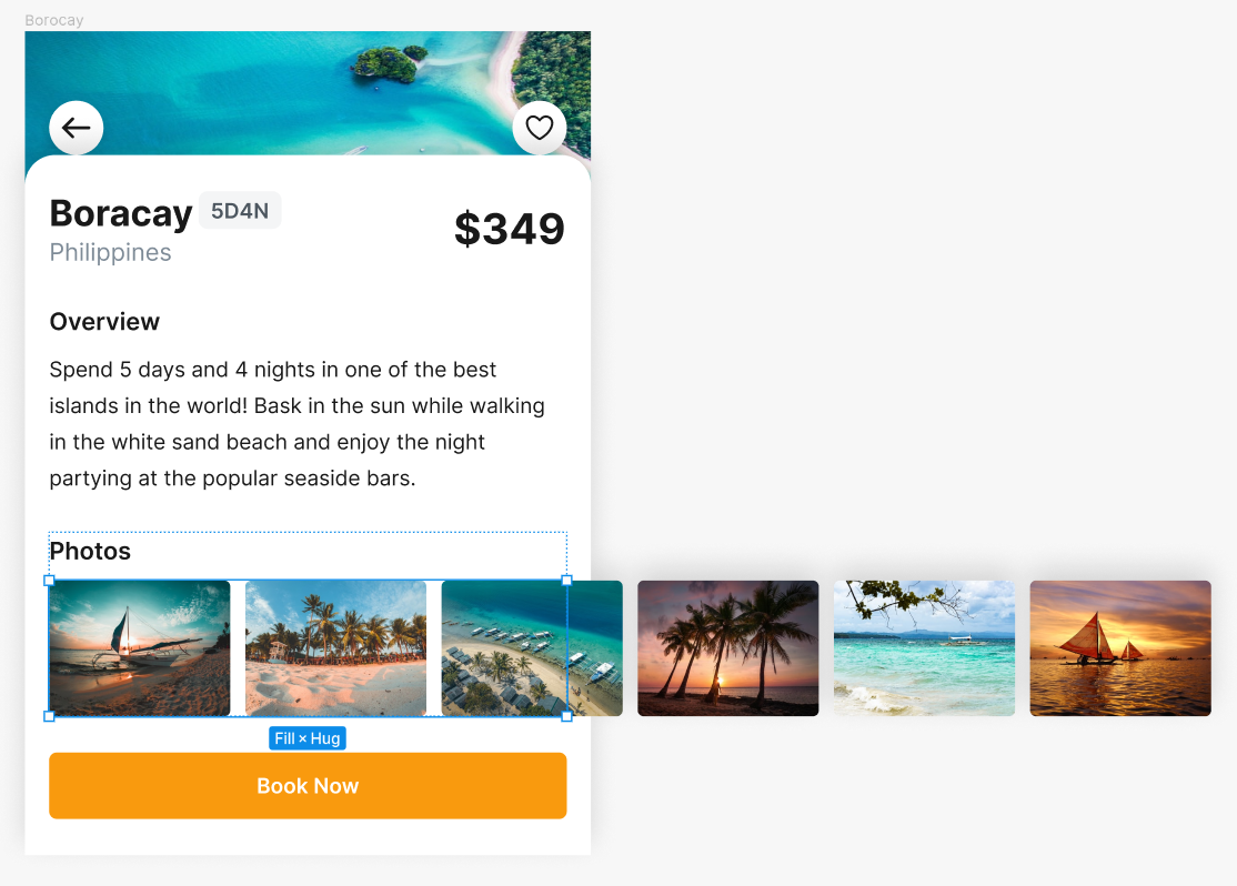
Scroll views are usually used when the contents exceed the width of the device frame.
-
To set up your scroll view, use a frame that fits within the size of your design. The contents of the frame can be allowed to overflow out of the frame as seen in the image below.
-
Then, select the frame which contains the overflowing content, and tag it as a “Scroll View”
-
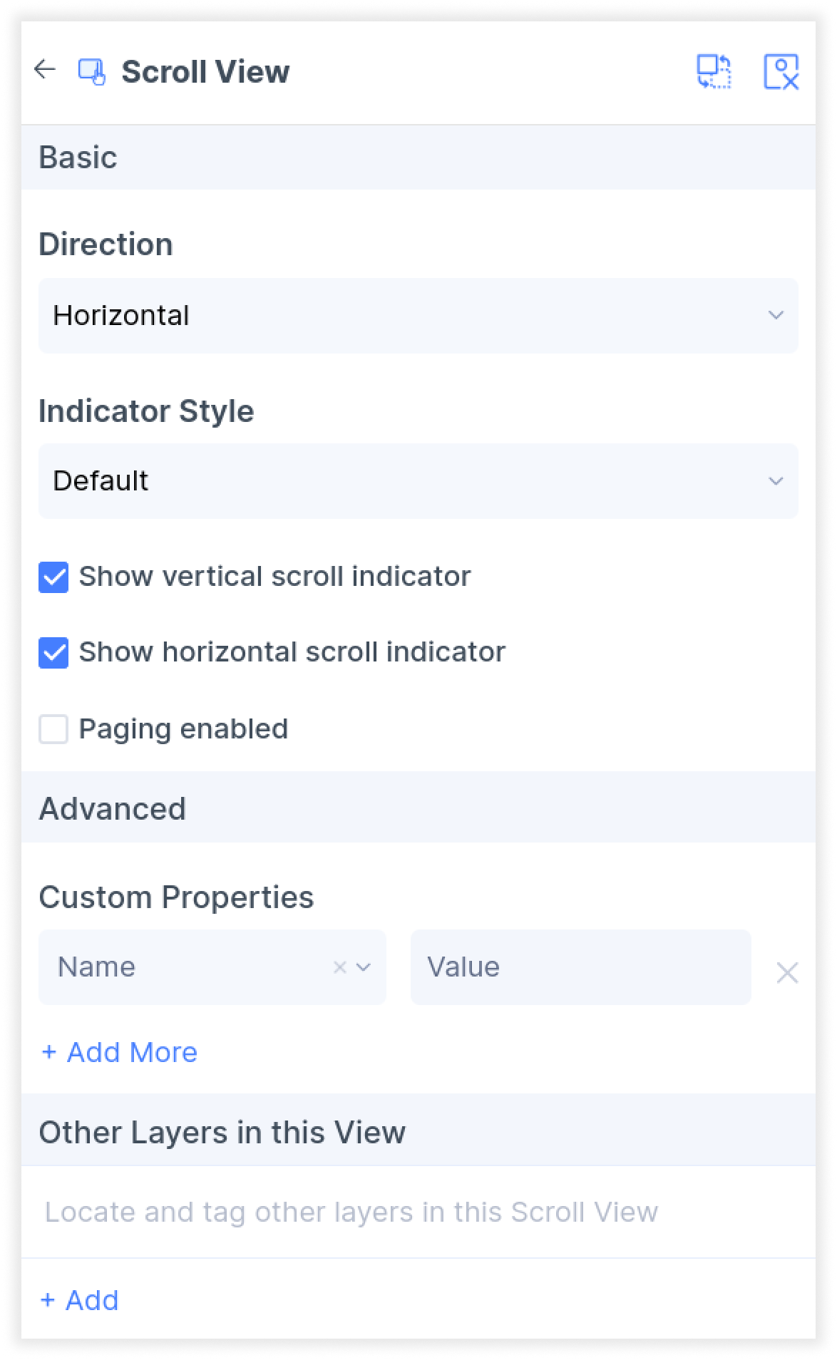
In the properties settings, set your scrolling direction to horizontal or vertical. You can also toggle the scroll indicators and choose the indicator style.
- Click done. You have now successfully set up your scroll view.
Tagging your Status Bars
- Select the status bar in your design and tag it as a “Status bar”. The option can be found in the Global Tags section of the Locofy plugin.
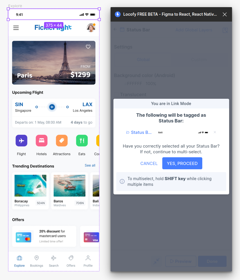
- You will then be taken to the properties tab. Here you can indicate if this status bar should use your global setting or override these settings or if you want to use custom settings for this specific status bar.

- You can then customize the background colour and toggle translucency for your status bar. Settings applied on the Global level will apply for all status bars. While settings applied on the Custom level only applies for the selected status bar.
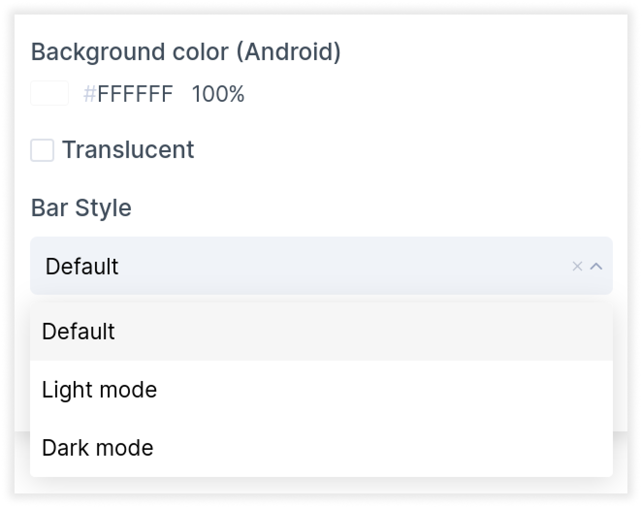
- Click done. You have now successfully tagged your status bar.
By tagging your layers, you can bring your design elements to life. Locofy is continuously adding support for new tags and components for you to use in your app.
If you have any requests for additional tag, please share your suggestions with us at support@locofy.ai