Working with Vuetify Components
Learn how to use Vuetify inside your design system.
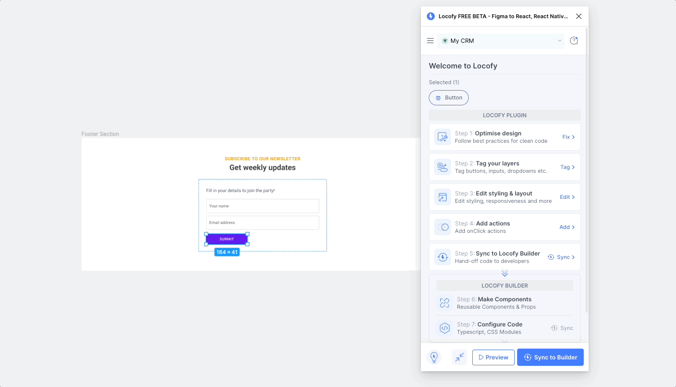
Tagging an Vuetify Design element
To tag an Vuetify element:
-
Select the Vuetify element from your Figma file.
-
Choose the tag from the Locofy plugin. Available tags will be highlighted based on your selection.
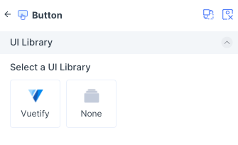
- Select Vuetify UI library.

- Select a Variation: Choose the variation of the element you are using
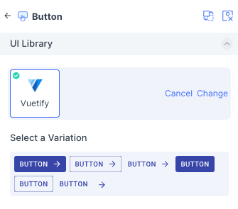
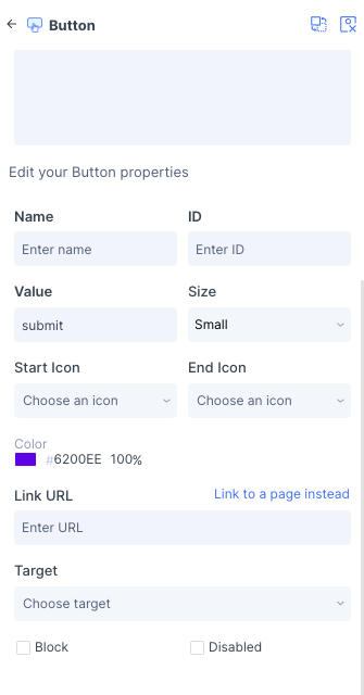
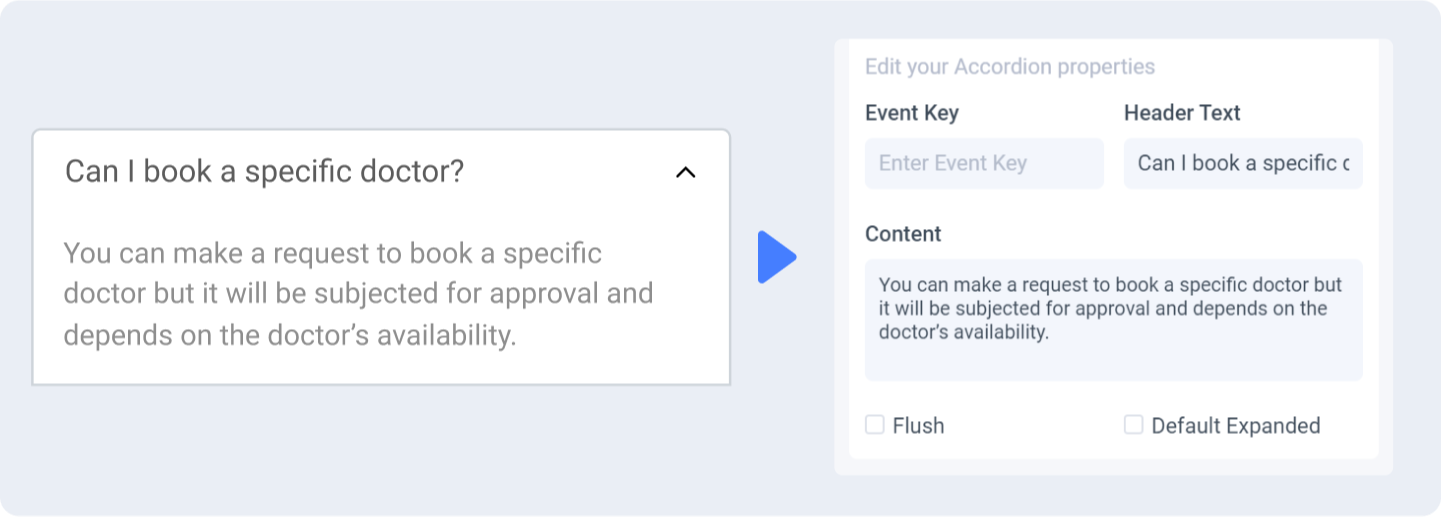
- Edit Properties: You can further define how this element should work.
-
Check the interactive preview: Play with the interactive preview to verify your element is correctly set up
-
Click Done.
Locofy provides an interactive preview for you to visualize your element while tagging.
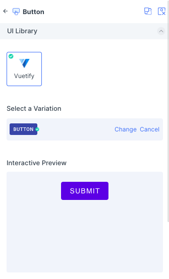
Any changes made to your properties settings will update and refresh the interactive preview.
Properties auto-detection
When tagging your Vuetify element, Locofy reads your Figma design to automatically populate properties for you.
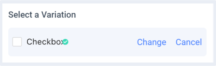
Change or cancel Variation
You can switch to a different variation or cancel the variation by clicking the ‘Change’ or ‘Cancel’ button respectively.
Theming
Customizable theming support for Vuetify is coming soon.
Vuetify Version
Vuetify package will be imported as a dependency for the generated code base.
- vuetify: v3.3.3