Bring your Storybook components to Locofy
With Storybook integration, you can now bring your own components from Storybook into the Locofy Plugin. Simply drag and drop the components into your design file, then get a live preview and export code for it.
Storybook is a tool that allows development teams to document and manage their UI system.
After writing code for your component (eg. a button), Storybook lets you easily display that component in different states and configurations. (eg. warning, pressed, disabled, etc)
Each configuration is called a “Story” and you can further toggle different properties to see different variations of the component.
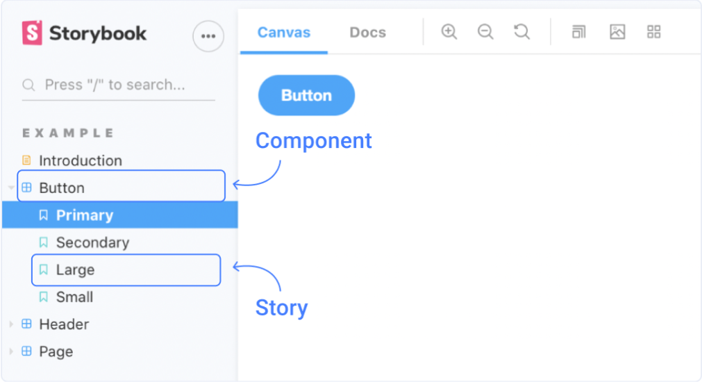
This helps developers and designers to easily manage and visualise all the components and variations, without needing to run any code.
Using your Storybook components in Locofy
Now with Storybook integration, the components and variations that you’ve set up in your Storybook can be used from the Locofy plugin drag & drop widget.
-
Ensure that you’ve connected your Storybook with Locofy. To learn how to set up the integration, view the “Setting up” section.
-
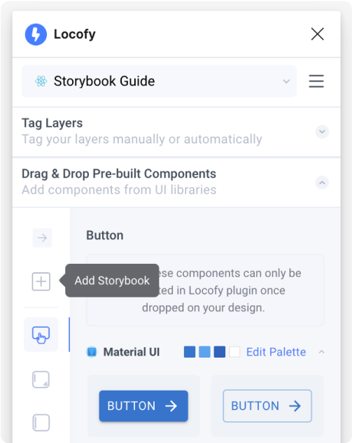
Once you’re connected, you’ll see the pink Storybook icon in the top left corner of the Drag & Drop Pre-built Component widget. Click on the Storybook icon.
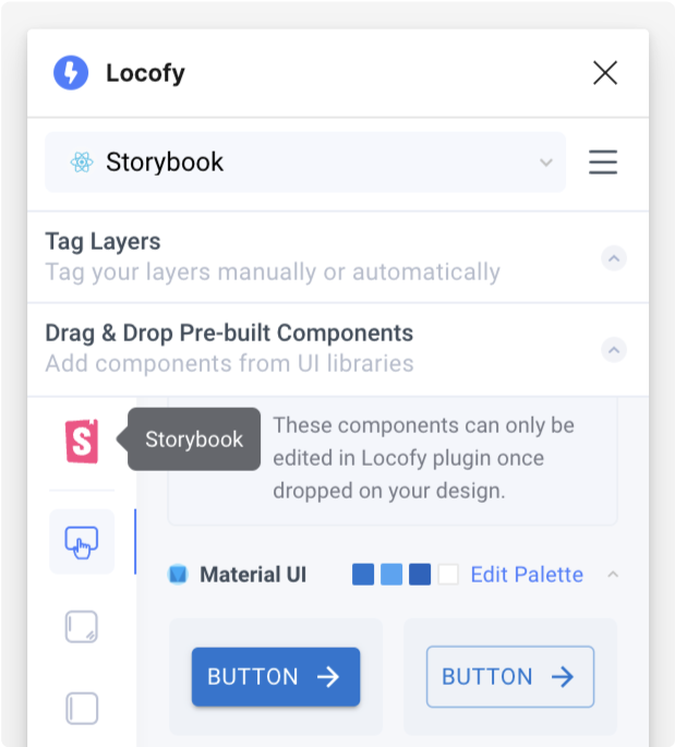
- You’ll be able to view the components and variations that are synced from Storybook.
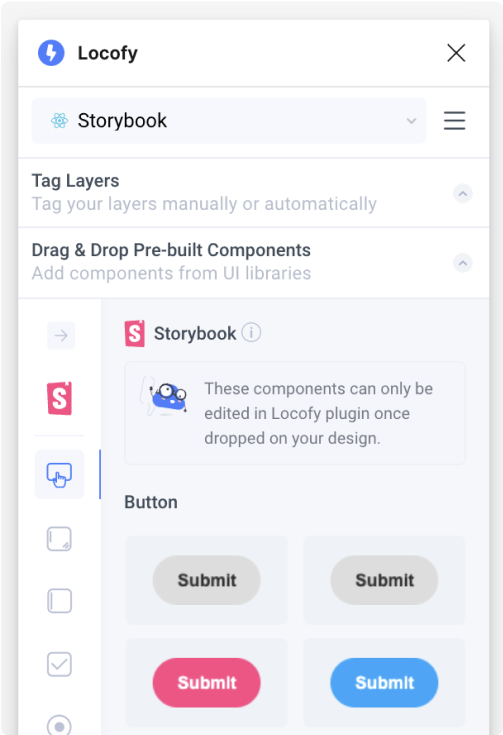
- Simply select a variation and drag it onto your Figma design.
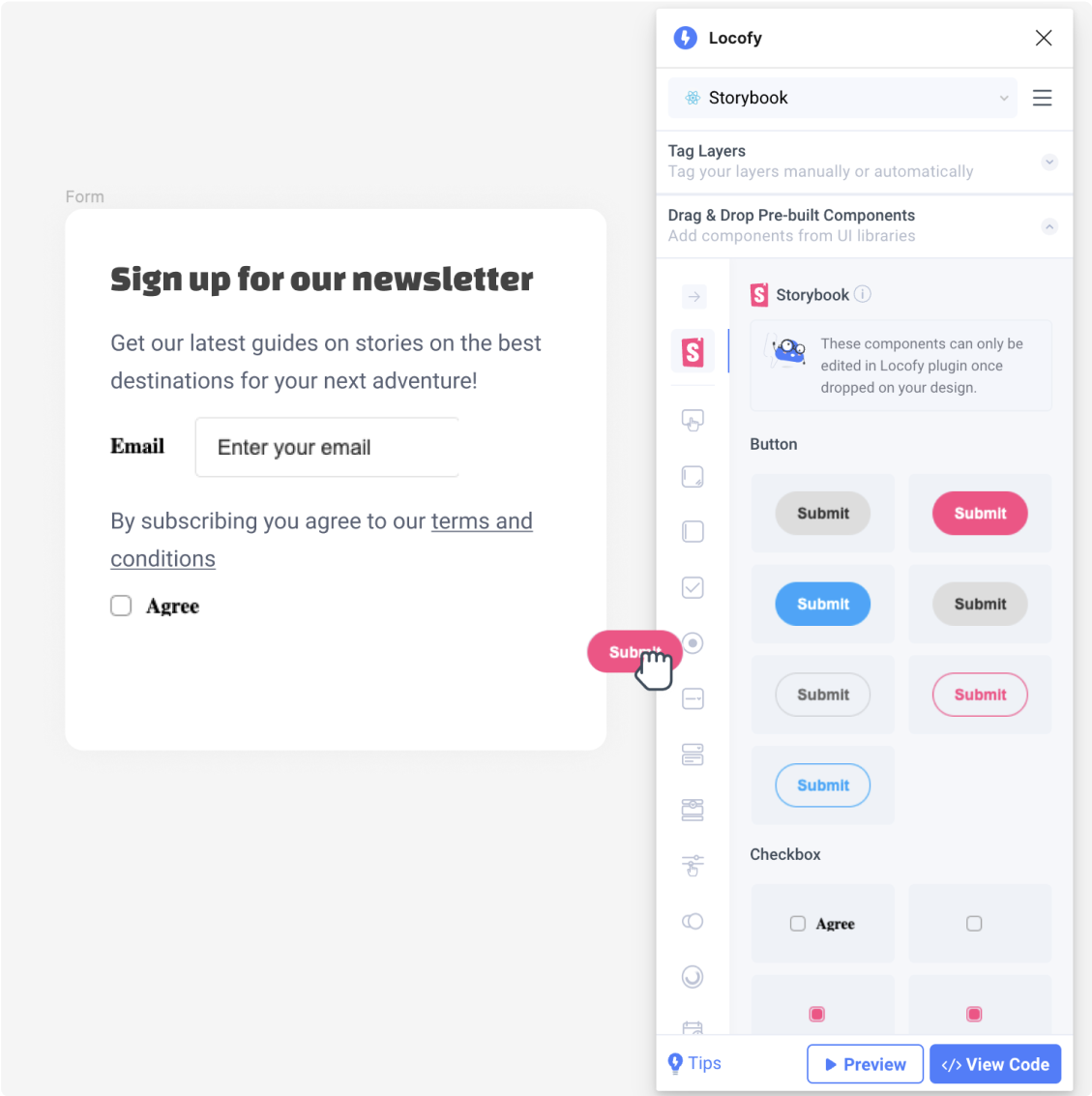
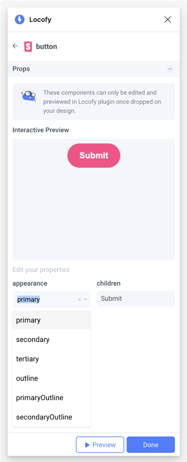
- Once you drop the component on your design, you’ll see the properties screen where you can view a live interactive preview of the component. You can also adjust properties based on how you’ve set up your Storybook args (opens in a new tab).
-
Click Done. You’ve succesfully used your Storybook component in your design!
-
Now, you can now view a live responsive preview your design with your live working components and interact with them by clicking “Preview”.
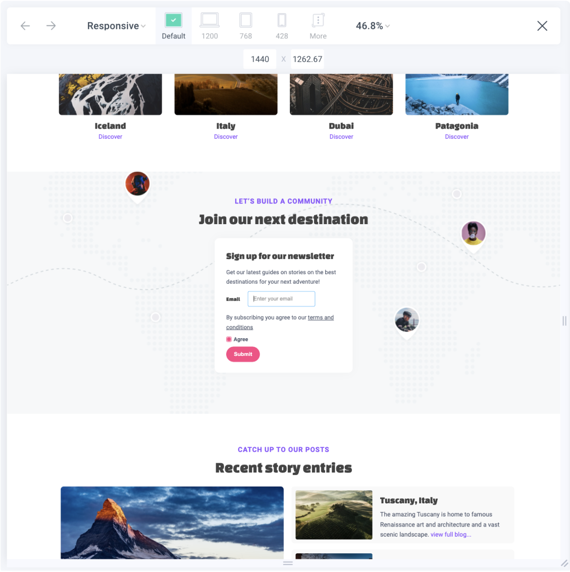
- Once you’re happy with your live preview, you can sync your code to Locofy builder to view and export code.
Running your exported code
The generated code is written to run using your own code components, hence after exporting, you will need to ensure that your components are imported as dependencies to run the code. Here are the steps to do so:
-
Unzip the downloaded file
-
Copy the exported code and assets into your existing repository
-
Ensure that required packages are imported. Locofy adds todos to remind you to import your code components that are being used.
import { FunctionComponent } from 'react';
//TODO: Add import for Storybook Radio Component
//TODO: Add import for Checkbox Radio Component
import styles from './FrameComponent.module.css';- You can now run your project
Setting up: Bring your Storybook components to Locofy
Here’s how to connect your Storybook with Locofy and bring your components into the Locofy plugin.
- In the Drag & Drop widget, select the “+ Add Storybook” icon
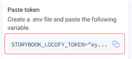
- You will be shown a personal Access Token and steps to install the Locofy Addon for your storybook. Ensure that you have copied the token for later use.
- Now, get the Locofy Storybook Addon by installing the package in your repository
npm install --save-dev @locofy/storybook-addon

OR

yarn add -D @locofy/storybook-addon- Once the package has been installed, you will need to register the addon in .storybook/main.js
module.exports = {
 stories: [],
 addons: [
    // Other Storybook addons
    '@locofy/storybook-addon', //👈 The addon registered here
 ],
};- Finally, you’ll need to add an environment variable called STORYBOOK_LOCOFY_TOKEN to store the access token you had copied earlier in Step 2.
If your repository does not have an existing .env file, you can create a new one in the root of your project:

- Next, create a static Storybook by running
npm run build-storybook

OR

yarn build-storybook- Then, sync once between Locofy and Storybook
npx locofy sync

OR

yarn locofy sync- Lastly, you can publish your Storybook by running this:
npx serve storybook-static

OR

yarn serve storybook-static- You’ve successfully installed the Locofy addon. Upon running Storybook, you should see the Locofy icon added as a new item in the Addons bar

- Click on the Locofy addon to export your selected components to the Locofy Plugin.
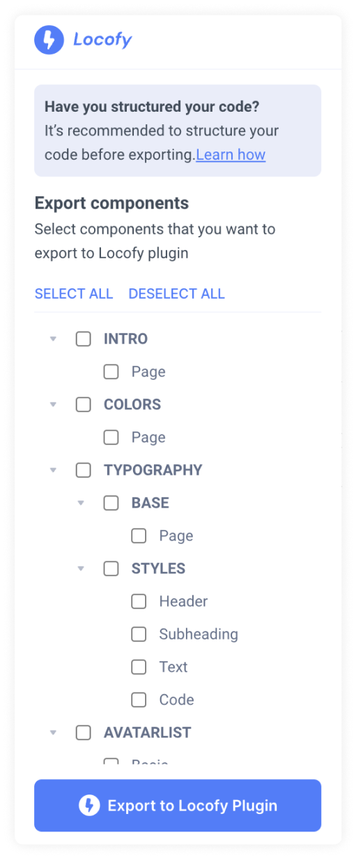
- You’re done! You can now drag and drop these components from the Locofy Plugin onto your design and export code that uses your own code components.
Requirements and Limitations
Supported Frameworks
The Locofy Storybook addon currently supports React components. Support for components from other frameworks is coming soon.
Structuring your Storybook code
Please ensure that your Storybook is structured in the following way:
- Component names must be unique.
- Each story should contain a single example of the component. Avoid including documentations as well as multiple examples in a single story.
- The customisable props and their argTypes must be exposed to Storybook. View the Storybook documentation on writing args here (opens in a new tab).
Limitations
These are the current limitations for the addon:
- Exported component should not contain any children components.
- The following argTypes controls are currently not supported:
- object
- file