Introducing Angular UI Libraries for Locofy
We’re excited to announce support for three popular Angular UI libraries, allowing you to fast-track your development by leveraging pre-built UI components. This integration enables you to reuse components from Material, Bootstrap, and Ant Design directly in your Locofy project.
Figma UI Kits and Code Repositories
To help you get started quickly, we’ve designed Figma UI kit that contains each library. These kits and code repositories contain components you can copy directly into your Figma designs, ensuring compatibility with Locofy’s mapping system. You can find the Figma files and their corresponding code repositories below:
- Angular UI Figma Kit (opens in a new tab)
- Material UI Code Repo (opens in a new tab)
- Ant Design Code Repo (opens in a new tab)
- Bootstrap UI Code Repo (opens in a new tab)
These code repositories contain pre-written components that Locofy will reuse when exporting your project, ensuring that no unnecessary new code is generated.
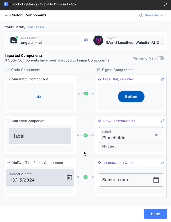
Importing Custom Components via CLI
Once you have the code repository for the UI library, you can easily import these components into your Locofy project using the Locofy CLI. Follow the steps in this guide to install the Locofy CLI, push your code components to Locofy, and map them to your design:
Automatic Mapping of Components
When your code is pushed to Locofy, the platform automatically maps the components from the code repository to the corresponding Figma components. This means that you don’t need to manually configure each component—Locofy will handle the process for you.
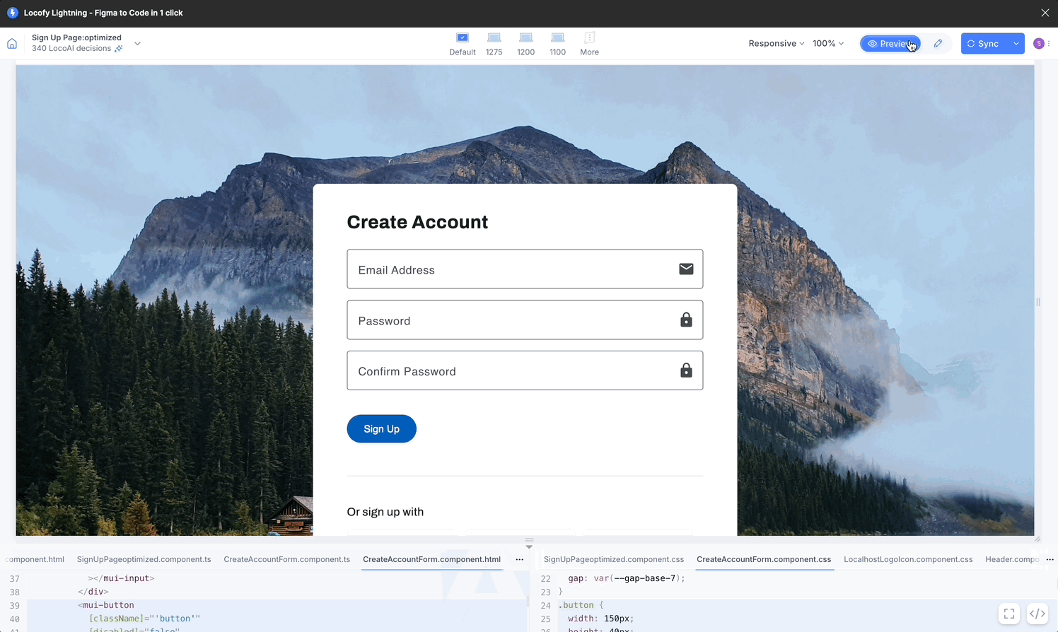
Working with Components in Locofy
Locofy automatically recognizes and maps different variants of the same components, ensuring that all variations are accurately linked to the correct props, as shown in the GIF below. Once mapped, the UI components will behave as interactive elements in Locofy’s preview mode. Features like hover effects, onclick events, and default states will be automatically applied based on the component’s behavior in the original UI library. For example:
- Buttons will have the default hover effect from Material UI.
- Date Pickers will include fully functional popover calendars without needing extra Figma design steps.
Customizing Components
Any props defined within Figma or the code repository are fully supported in Locofy. You can modify these props, such as changing styles or text labels, directly within the Locofy platform. These changes will be reflected instantly in the preview and code.
So with Locofy’s support for Angular UI libraries, you can significantly reduce the time spent on designing and coding, ensuring faster project delivery and high-quality output. Get started by exploring the Figma kits and repositories, and integrate them into your projects today!