Figma Components
Learn how you can create and structure figma components for optimal code conversion. This guide will walk you through the steps to create Figma components with props and also showcase how to structure Figma Variants

Note: View figma component properties playground file here.
Overview

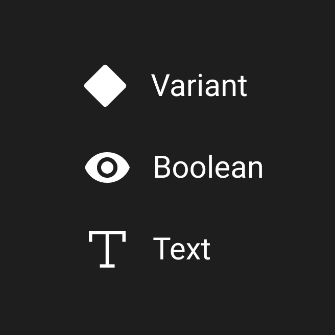
Locofy supports the following types of Figma Component Properties:
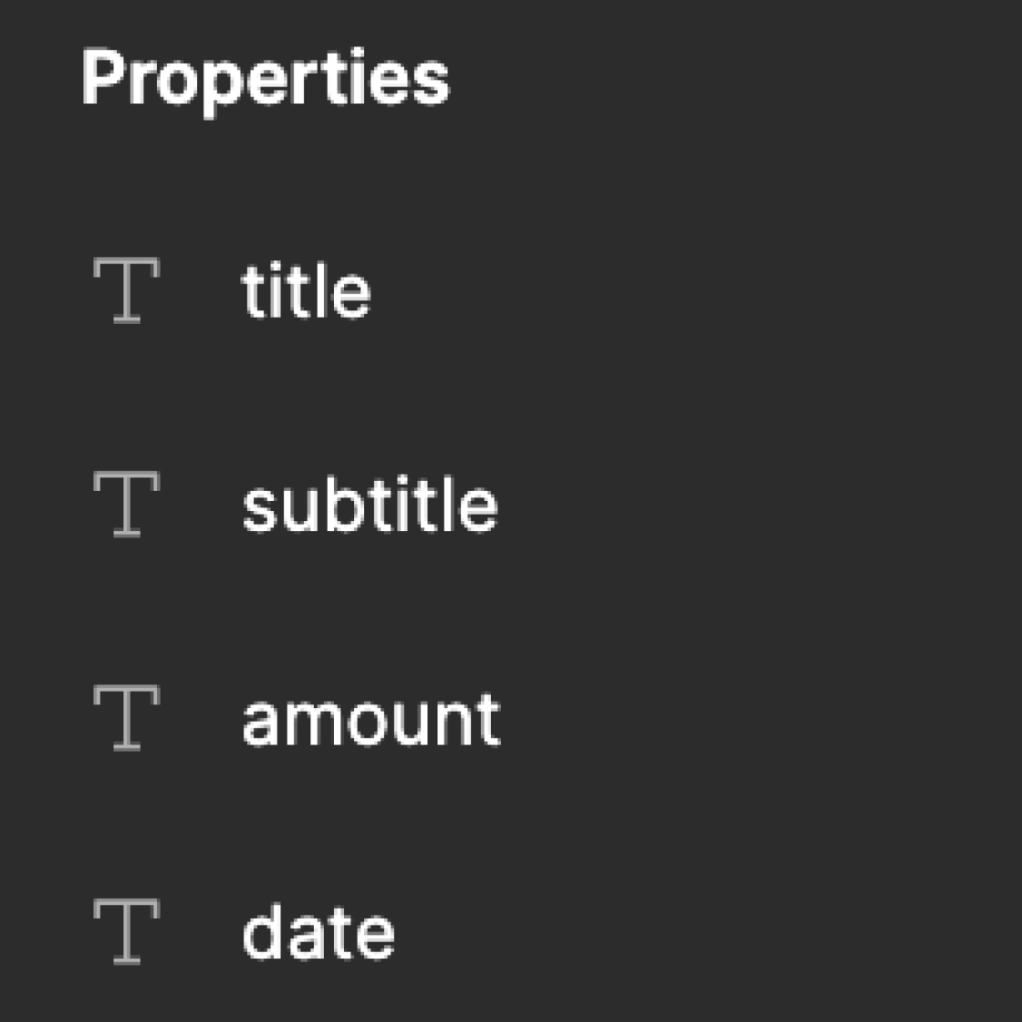
- Text Property
- Boolean Property
- Variant Property
We will be adding wider support for Variant & Instance Swap properties soon.
Note: View Figma documentation on how to create Figma Components with properties.
Structuring Figma Components
Creation of Figma Components
Adhere to the following steps for optimal code:
- Create all Figma components outside the screens
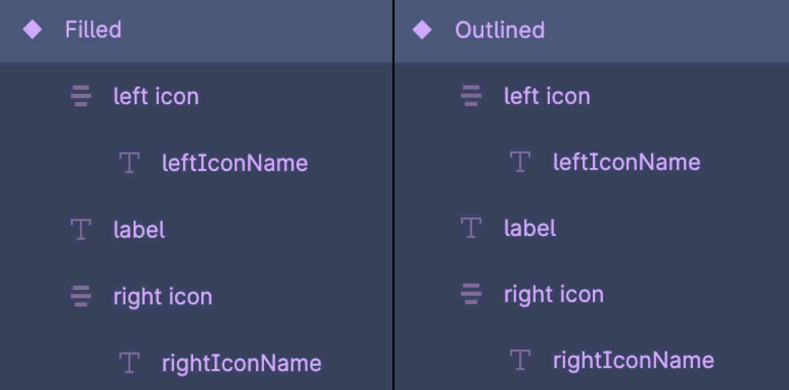
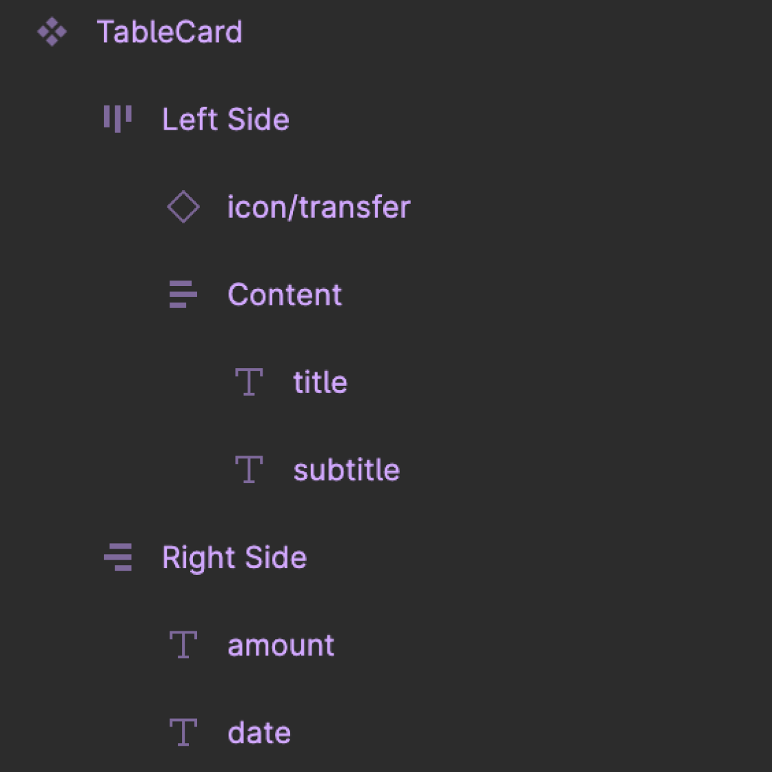
- Ensure you name all the layers inside the figma component with the appropriate layernames for optimal css. The names of the Figma Component Properties should be in Camel Case [a-zA-z]
- Create Text properties for the dynamic content. Ensure that the layername is the same as the property name.
- Create Boolean properties in case you need to show and hide certain parts of the design. For optimal naming make use the naming like
is{PropertyName}orshow{PropertyName} - Create Variant properties for different states or types of the same component. Ensure that the internal layer structure is the same for all the variants
Do's & Don'ts for creating Figma Components:
- Simplify the internal layer structure for optimal HTML & CSS
- Avoid Changing the styles of the Instances to avoid creation of extra style props
- Add autolayout to ensure generation of responsive flexbox based code.
- You can create instance swap properties for dynamic icons. In case of dynamic Background Images you do not need to create any figma component property.
Handling Corner Cases for structuring Figma Components
1) Using Truncate text property for longer text layer:
- Ensure that every text layers has
widthashug contentorfill container. - Ensure that every text layers has
heightas hug content. - If you need the text layer to truncate after a maximum number of lines use the properties in Figma else by default the text layers will wrap.
2) Handling Nested Components :
- Expose the properties of the Child component if they need to be passed from the Parent Components.
- Avoid creation of slots while creating Figma components.
Note: You can create instance swap properties for icons. In case of Background Images you do not need to create a property.
3) Creation of Figma Variant Set:
- When creating Figma Variants ensure that each variant has the same internal structure.
- Create all combinations of the properties to maximum reusability.
- Create Variants sets when you need components instances to have different styling properties. An example if width as
hug contentorfill container.