Figma Variables
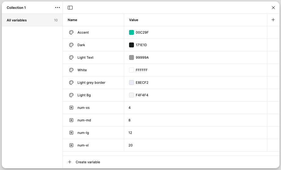
Figma Variables help designers and developers maintain consistency, scalability, and efficiency in their designs.
They allow you to define reusable values—such as colors, spacing, typography, and even dynamic values like themes or mode-based adjustments—so that changes can be made globally with minimal effort.
Locofy's Support For Figma Variables
Locofy supports Figma Variables to ensure a smooth and efficient design-to-code workflow. By automatically detecting and applying supported variables, Locofy helps maintain design consistency while reducing manual effort during development.
Locofy supports the following types of Figma Variables:
- Color Variables
- Number Variables

Color Variables
Supported color properties:
- Fill
- Stroke
- Shadow
- Gradient
Number Variables
Supported number properties:
- Padding
- Gap
- Border Radius
- Width
- Default
- Min width
- Max width
- Height
- Default
- Min height
- Max height
- Stroke Width
- Opacity
Drop Shadow:
- x & y
- Blur
- Spread
Inner Shadow:
- x & y
- Blur
- Spread
Typography
- Font Size
- Line Height
- Letter Spacing
- Font Weight
How to Configure Locofy to Pick Up Figma Variables
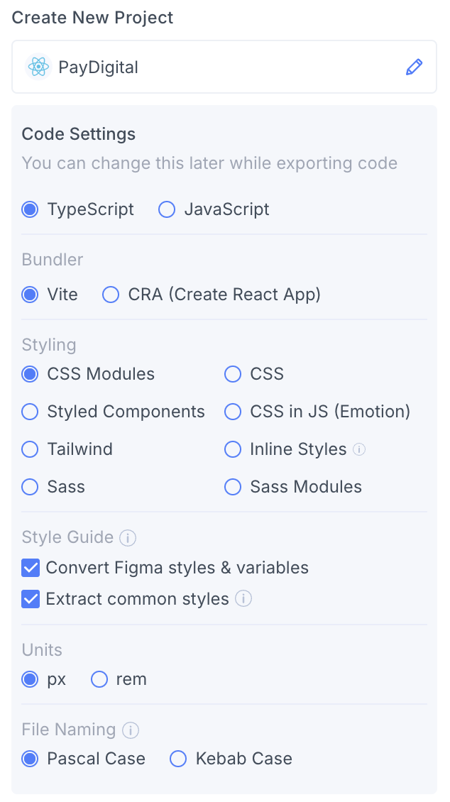
During project creation in Locofy, you are provided with two checkboxes to configure the tokens:
- Convert Figma Styles and Variables – This picks up and applies your Figma variables directly into the generated code.
- Extract Common Styles – This automatically converts repeated values into style variables, ensuring consistency across your code.
You can also toggle them later on in the Locofy Builder code config panel. Your global stylesheet or config file will update accordingly to reflect the changes.
Locofy follows a structured naming convention when generating CSS variables, ensuring clarity and consistency in your styles. It organizes variables based on categories like colors, font sizes, gaps, paddings, and border radii, making it easier to maintain and scale your code.
Your global.css file will contain your variables after you enable these settings under the Style guide. Below is a sample global.css file:
body {
  margin: 0;
  line-height: normal;
}
:root {
  /* Fonts */
  --font-archivo: Archivo;
  --font-roboto: Roboto;

  /* font sizes */
  --font-size-sm: 14px;
  --font-size-base: 16px;
  --font-size-md: 18px;
  --font-size-lg: 20px;

  /* Colors */
  --color-black: #000;
  --color-gray-100: #fafafa;
  --color-gray-200: #7a7a7a;
  --color-gray-300: rgba(0, 0, 0, 0.85);
  --color-lightcyan: #defff9;
  --color-saddlebrown: #975b00;
  --color-whitesmoke: #f4f4f4;

  /* Gaps */
  --gap-0: 0px;
  --gap-xs: 4px;
  --gap-md: 8px;
  --gap-base: 16px;
  --gap-xl: 20px;

  /* Paddings */
  --padding-0: 2px;
  --padding-md: 8px;
  --padding-base: 16px;
  --padding-xl: 20px;

  /* Border radiuses */
  --br-half: 0.5px;

  /* Figma Variables */

  /* Color Variables */
  --accent: #00c29f;
  --dark: #171e1d;
  --light-grey-border: #e8ecf2;
  --light-text: #787878;
  --white: #fff;

  /* Number Variables */
  --n-0: 1px;
  --n-1: 2px;
  --n-2: 4px;
  --n-4: 6px;
  --n-5: 8px;
  --n-6: 10px;
  --n-7: 12px;
  --n-8: 14px;
  --n-9: 16px;
  --n-10: 18px;
  --n-11: 20px;
  --n-13: 24px;
  --n-15: 28px;
  --n-16: 30px;
  --n-17: 32px;
  --n-18: 36px;
  --n-19: 40px;
  --n-20: 48px;
}