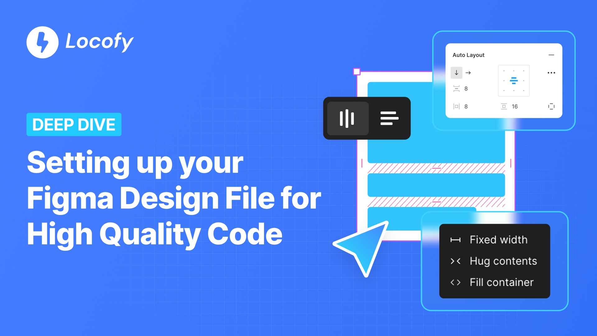
Setting Up Your Figma Design File for High Quality Code
A well-structured design file helps Locofy generate good quality code.
This guide provides actionable tips to optimize your design files, making them developer-friendly and easier to implement. Following these best practices can help reduce time spent on debugging, refactoring, and communication.
Signs of a Poorly Structured Design
One quick way to check if your designs are well-structured is to see how well they adapt to different screen sizes. Try reducing the width of your design and observe if the elements inside adjust accordingly.
If they are not responsive, it’s a sign of structural issues. Here are some common problems to look out for:
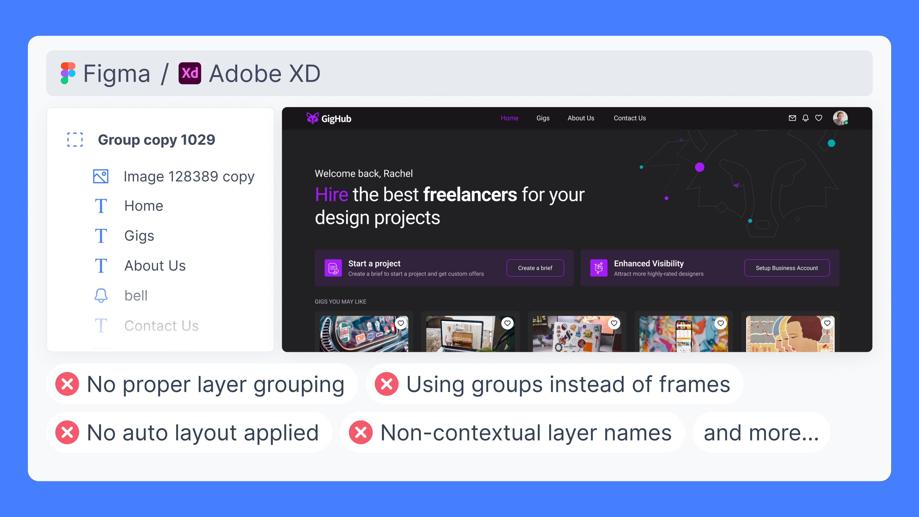
- Poor Grouping → Makes it hard to select and align elements, leading to inconsistent gaps and constraints.
- No Auto Layout → Without Auto Layout, elements must be manually adjusted, making it difficult to maintain consistency, spacing, and responsiveness across different screen sizes.
- Fixed Width & Height → Elements with fixed sizes cannot adjust to different screen sizes, breaking responsiveness.
- Overlapping Elements → Elements overlap due to improper spacing and alignment.
- Redundant Frames → Unnecessary layers that add complexity without any visual contribution.
- Missing Constraints → Absolute elements without proper constraints can cause the layout to break when the frame size changes.
Steps to Optimise Your Designs
1. Group Your Layers
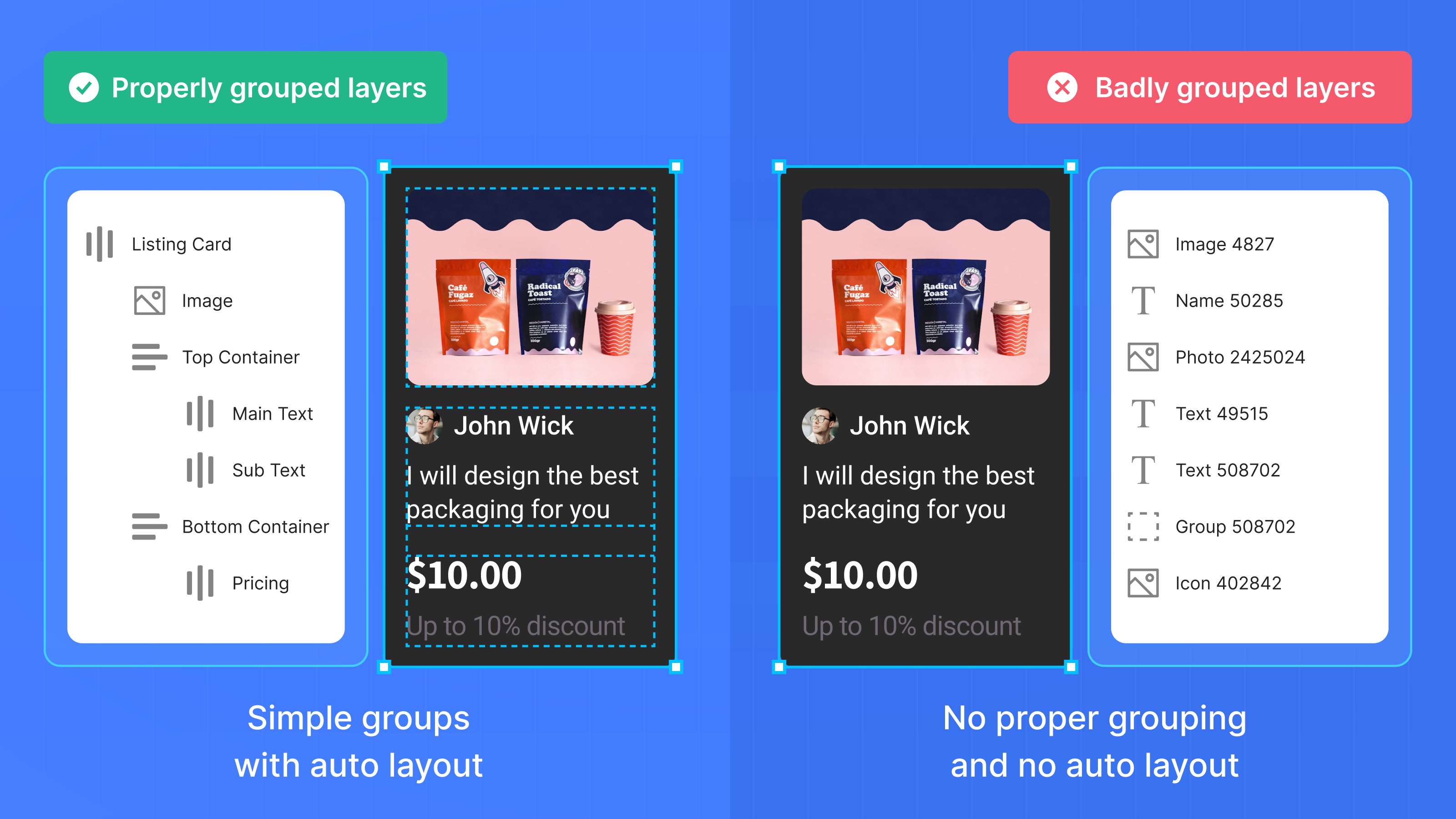
This is the starting & most important step of your optimisation process. It establishes relationship between elements & allows you to apply further properties correctly such as Auto Layout and consistent gaps for cleaner, responsive code.
Which Elements Should Be Grouped Together?
- Group elements that move together.
Example: A button and its text should be grouped so they stay aligned. - Each section of your design should have its own group.
Example: The navigation bar, footer, or card components should each be in their own group. - Avoid grouping unrelated elements.
Example: A button should not be in the same group as a random image on the page.
Steps to Clean Up Your Layers
-
Group related elements for easier selection and alignment.
- Select related elements (e.g., header, footer, buttons, cards).
- Right-click and select Group or use ⌃ + G (⌘ + G on Mac).
-
Remove unnecessary layers to keep your file clean.
- Right-click on unused layers and select Delete or press Delete on your keyboard.
-
Use Frames instead of Groups for better organisation.
- Select the elements you want to contain in a frame.
- Press ⌃ + ⌥ + G (⌘ + ⌥ + G on Mac) to convert a group into a frame.
2. Apply Auto Layout
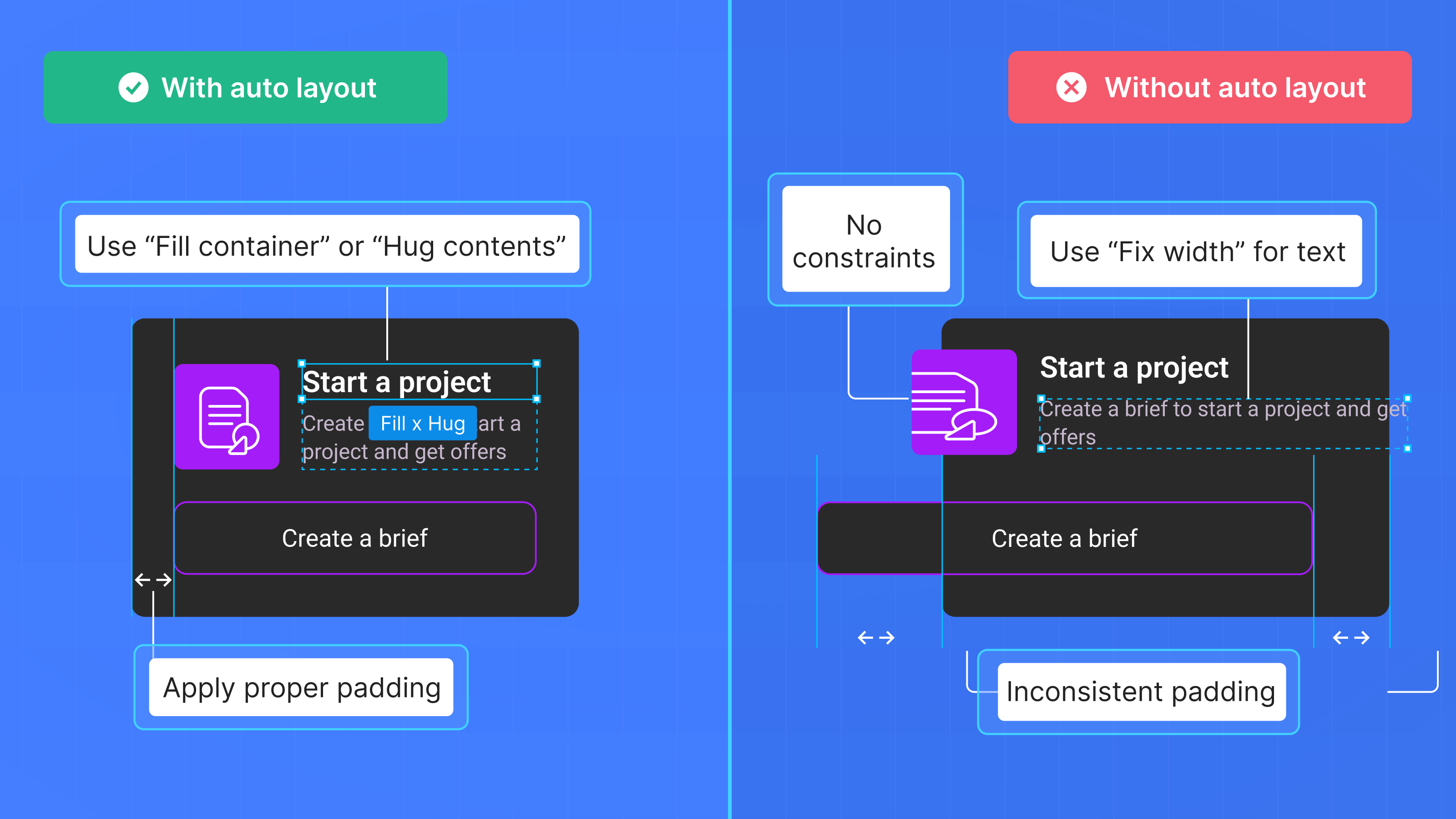
Auto Layout helps your design stay responsive by automatically adjusting spacing, alignment, and positioning when elements change in size. Instead of manually moving things, Auto Layout does the work for you.
- Direction & Wrap → Align elements vertically or horizontally. Enable Wrap to move items to a new row when they don’t fit.
- Sizing → Choose between Hug Contents, Fixed, or Fill Container to control how elements resize.
- Min-Max Width & Height → Set size limits to prevent elements from becoming too small or too large.
How to Apply Auto Layout
- Select the elements you want to organise.
- Add Auto Layout → Click the Auto Layout button in the right panel or use ⇧ + A .
- Set Direction → Choose horizontal or vertical; enable Wrap if needed.
- Adjust spacing & alignment in the right panel.
- Choose the right resize setting:
- Hug Contents → Stays as small as possible, expanding only when needed.
- Fixed Width/Height → Remains the same size regardless of content.
- Fill Container → Expands to fit available space.

3. Ensure Consistent Gaps & Alignment
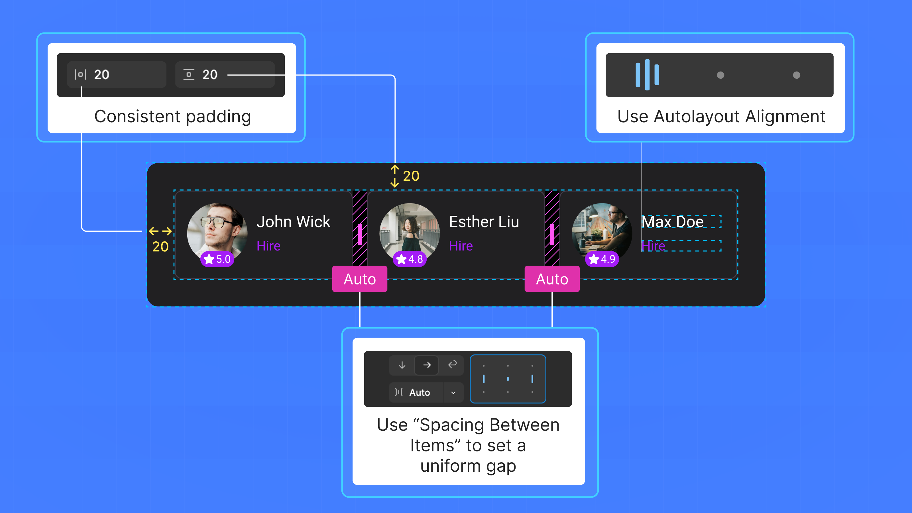
Maintaining consistent spacing and alignment is crucial for a clean and professional design. Auto Layout helps maintain the uniformity.
Avoid manually aligning items and instead use Auto Layout to align elements for better precision.
Maintain Consistent Gaps & Padding
- Set a uniform gap between elements.
- Apply padding inside frames to keep elements properly spaced from the edges.
- Use consistent spacing values (e.g., 8px, 16px, 24px) to create a structured layout.
Align Elements Properly
- Use Auto Layout alignment settings (left, center, right, top, middle, bottom) to ensure elements are positioned correctly.
- Set “Fill Container” when elements need to stretch and align within their frame.
4. Use Background Images Instead of Absolute Ones
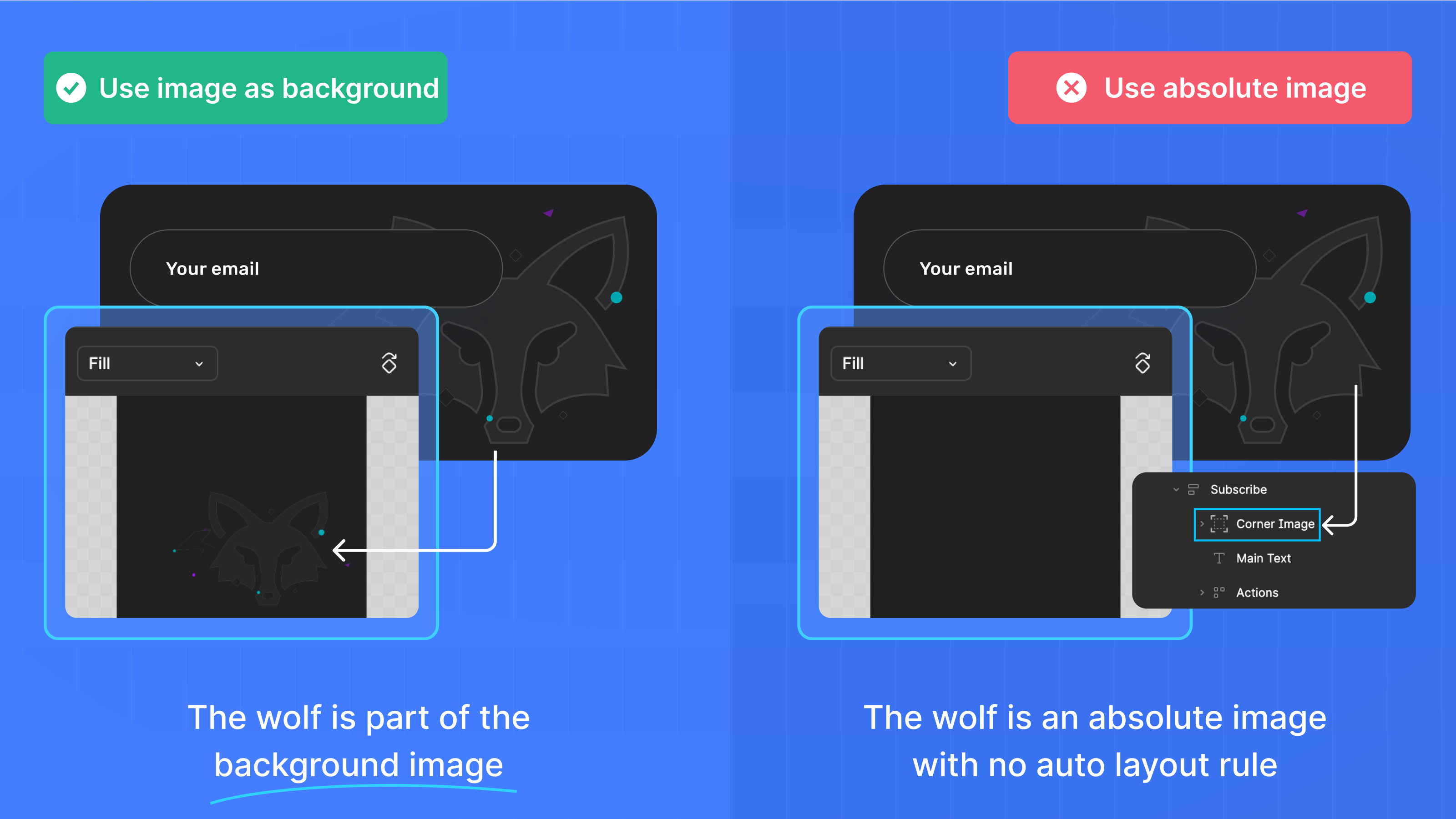
Using fill or background images keeps your design flexible and responsive, unlike absolute images that remain fixed in size and position.
This approach ensures images scale properly without distortion and align consistently within frames.
Steps to Apply an Image as a Fill
- Select a frame or shape where you want to add an image.
- In the right panel, go to the Fill section and click the “+” icon.
- Click on the color preview, then switch to Image in the Fill settings.
- Adjust the object fit mode (e.g., "Fill," "Fit," or "Tile") for the best result.
- Delete any absolute images that were manually placed to keep your layers clean.
5. Use Strokes for Dividers & Separators
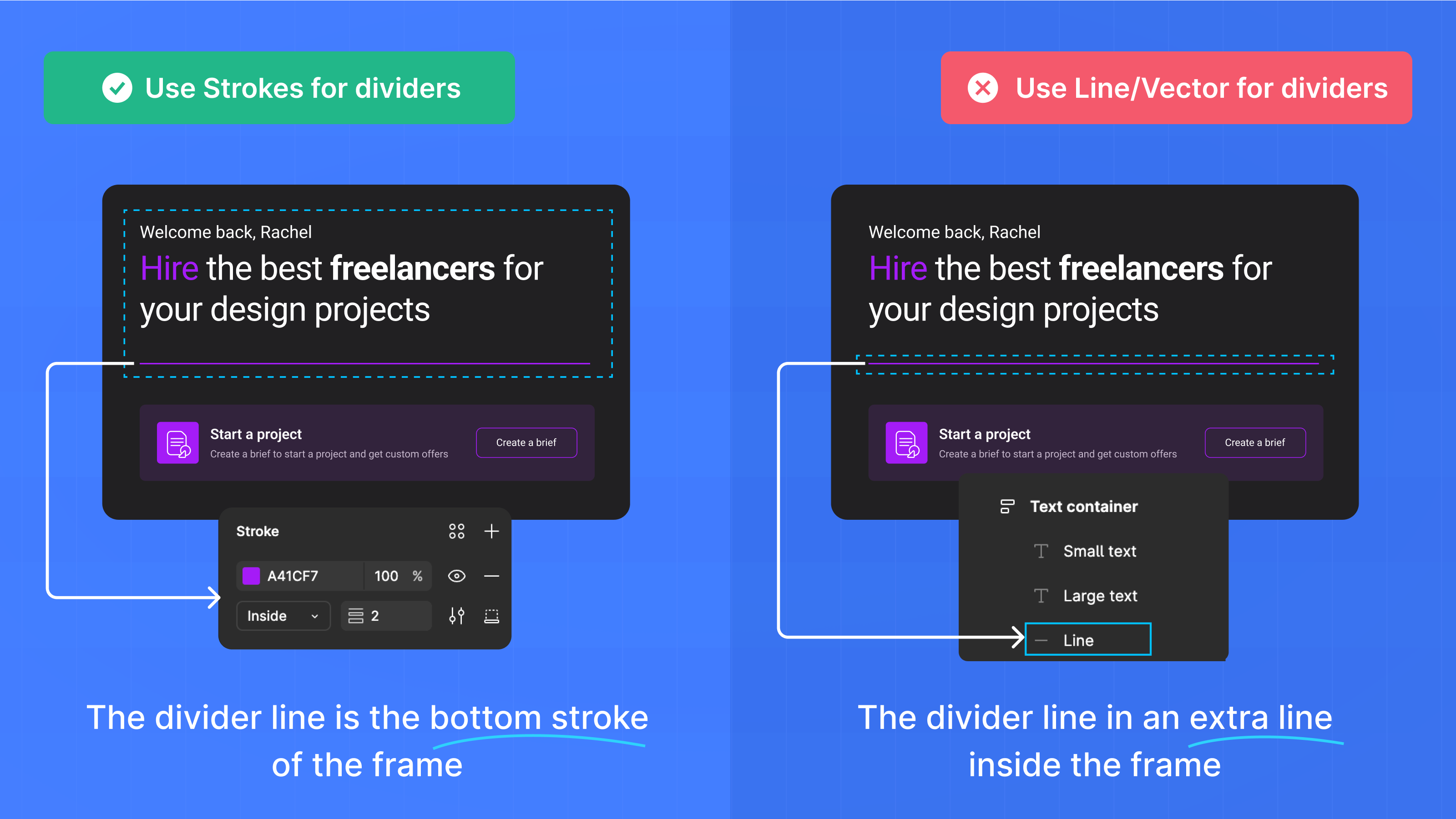
Strokes are a cleaner and more efficient way to create dividers instead of using rectangles or lines. They keep your design lightweight and does not generate unnecessary code.
Steps to Apply Strokes to Create Borders
- Select the element where you want the divider (e.g., a section, card, or menu item).
- In the right panel, find the Stroke section and click "+" to add a stroke.
- Set the Stroke Position to Bottom to create a divider effect.
- Match the stroke color to your existing divider rectangle for a seamless look.
- Delete the original rectangle used as a divider to simplify your layers.
6. Use Paragraph Spacing Instead of Extra Lines
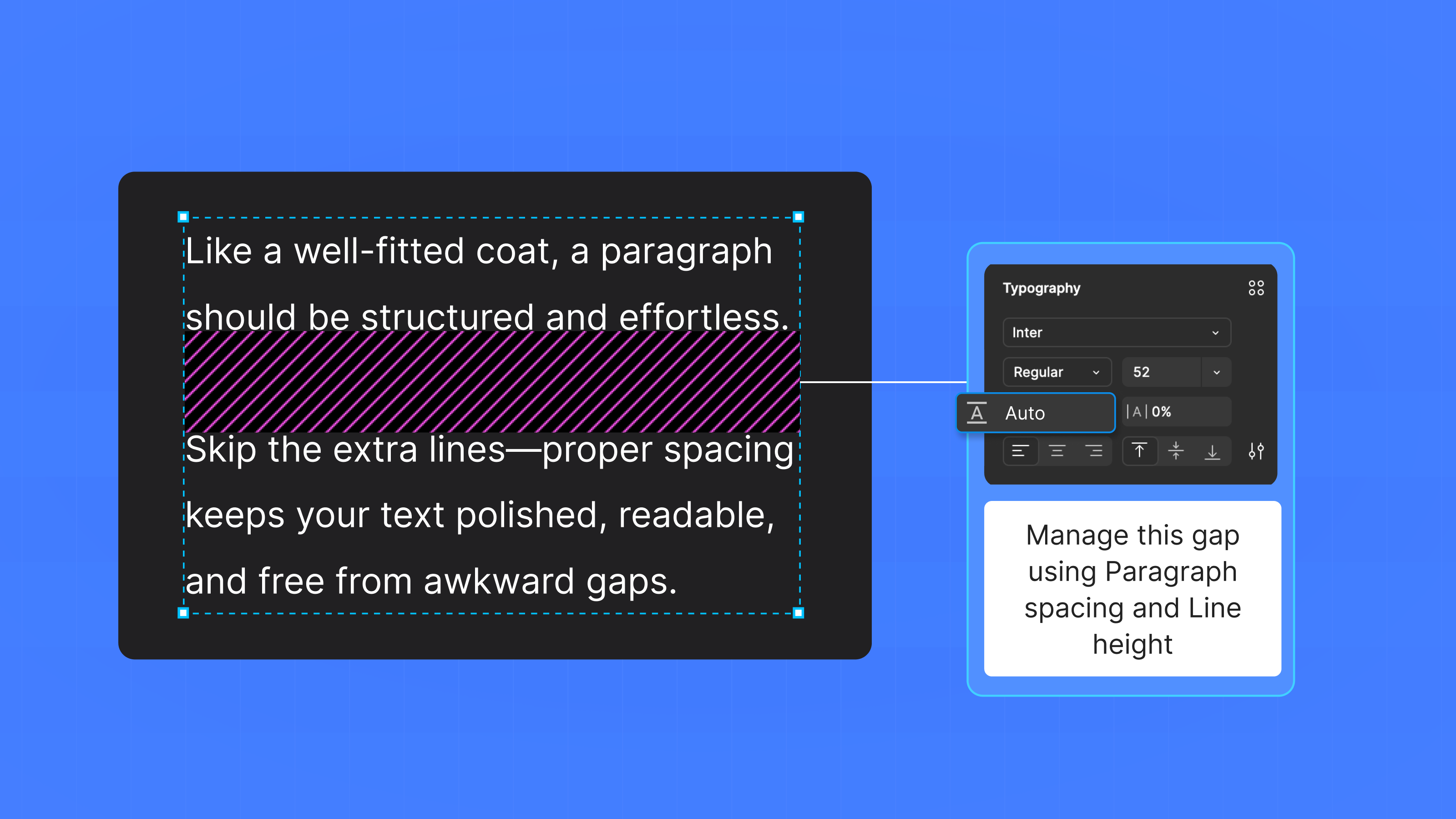
Using paragraph spacing ensures clear separation between text blocks without unnecessary line breaks.
Steps to Set Correct Spacing
- Select the text box containing your paragraph.
- In the right panel, find the Text section.
- Look for the Paragraph Spacing option—represented by an "A" icon with two horizontal lines (one above and one below).
- Enter a spacing value (e.g., 8px, 12px, or 16px) to control the gap between paragraphs.
- Adjust Line Height (Leading) to improve readability (typically 120%–150% of the font size).
7. Create Figma Components for Reusable Elements
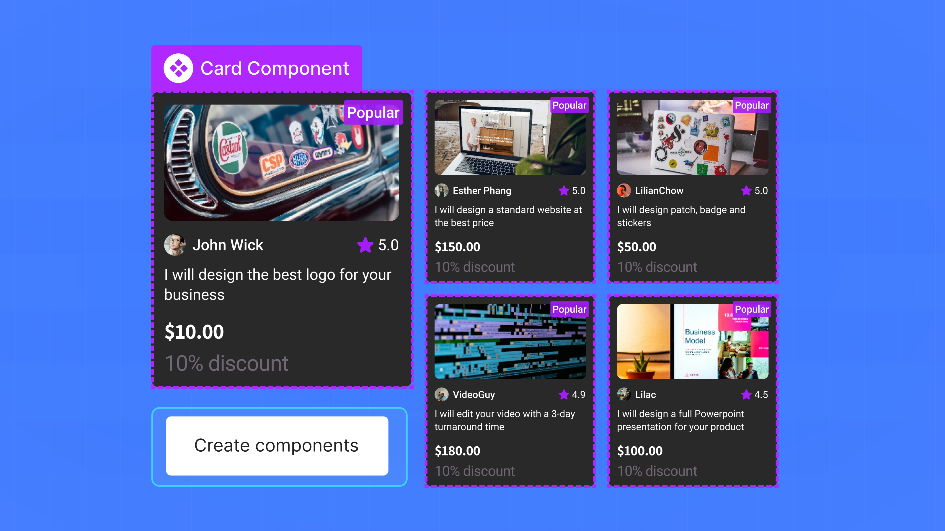
Figma Components help maintain consistency and reduce redundancy by allowing you to reuse UI elements across multiple screens. Instead of manually updating each instance, you can edit the main component, and all linked elements will update automatically.
We recommend applying Auto Layout to your elements before converting them into a Figma component so they can be responsive when you reuse them in different designs.
Steps to Create & Use Figma Components
- Select a UI element (e.g., button, card, navbar) that you want to reuse.
- Right-click and select "Create Component" or use ⌃ + ⌥ + K (⌘ + ⌥ + K on Mac).
- Find your component in the Assets panel and drag it onto your design to reuse it.
- Customize instances without affecting the main component (e.g., changing text or colors).
8. Clear Layer Naming
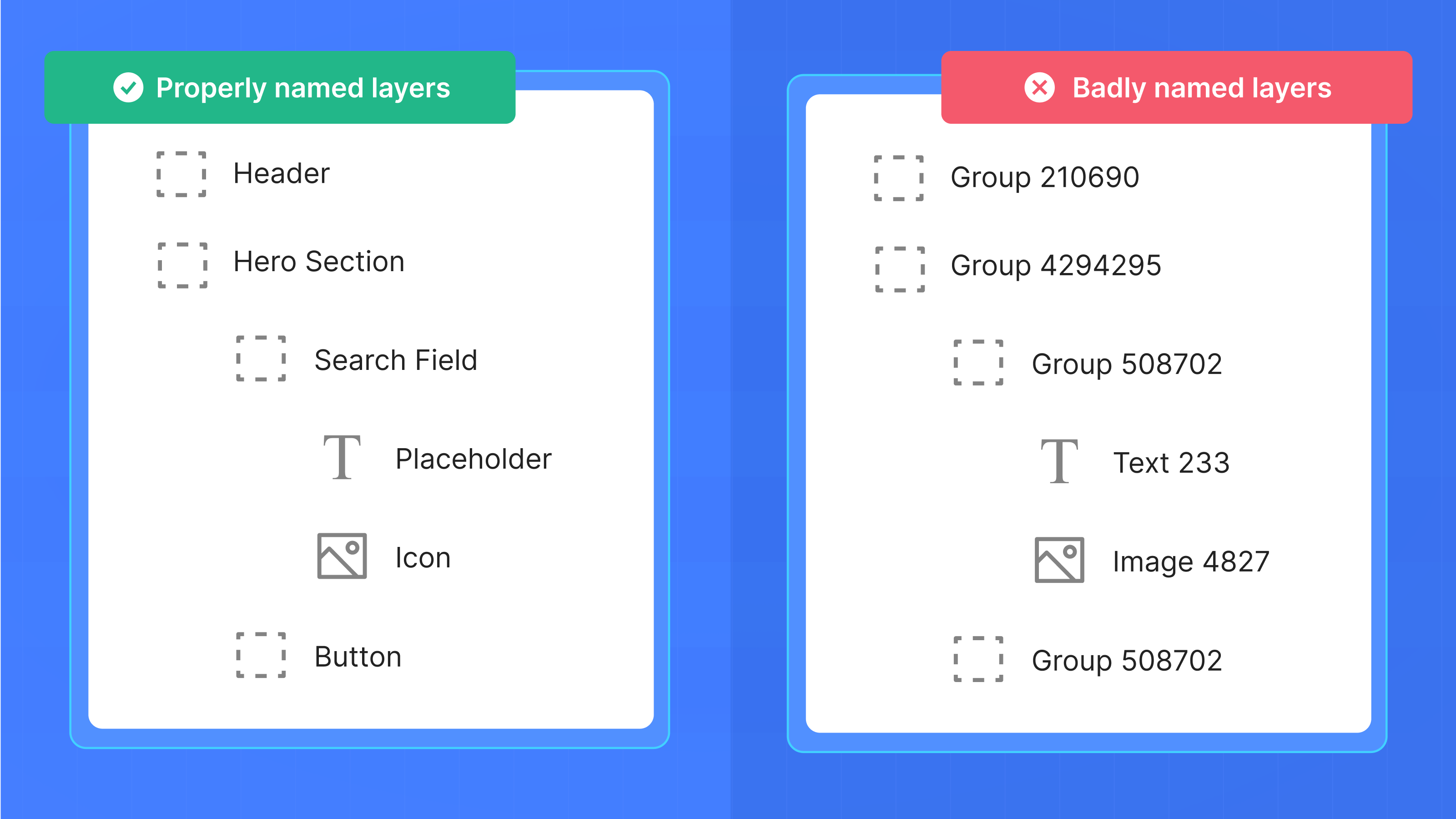
Naming layers properly in Figma keeps your design organised and ensures cleaner class and component names when exporting to code.
Steps to Rename Layers
- Click on a layer in the Layers Panel.
- Right-click and select "Rename" or double-click the layer name to edit it.
- Use a descriptive name (e.g., "header-logo" instead of "Rectangle 1").
- Follow a consistent naming format, such as component-name/element-name (e.g., "button/primary").
Detailed Video Walkthrough
This video covers all the steps above and additional tips to optimise your designs for high-quality code generation with Locofy.