Locofy Builder Tour
Get familiar with Locofy Builder.
Accessing Locofy Builder
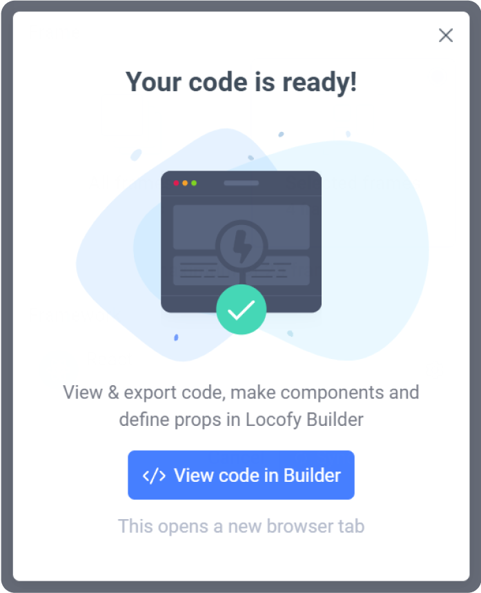
To access the Locofy Builder, open your design in Figma and sync your project using the Locofy plugin. When the sync is complete, you can click the “View code in Builder” to open your project in the Locofy Builder.
NOTE: The Builder requires a monitor or laptop that has a screen width of at least 960px. This is required to display the left side bar, the design viewer and the right sidebar.
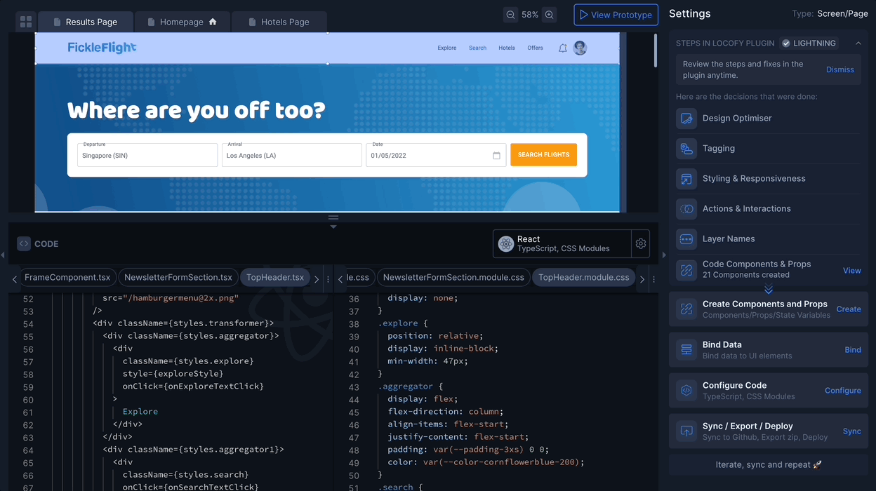
Sections of the Locofy Builder
Locofy Builder consists of 5 main sections:
- Top Toolbar: This toolbar provides essential functions for project management and collaboration.
- Preview Screen Panel: This panel allows you to visualize your project preview as you make edits.
- Code Viewer Panel: This panel lets you view the code behind your project.
- Left Side Panel: This panel offers various tools like File explorer, Layer panel, Github sync etc.
- Right Side Panel: This panel helps you manage Components, Configuration, Export, Deployments etc.
Let's dive deep into each of these in detail.
Top Toolbar
The top toolbar provides access to project manager, add collaborators and switch media queries features

Project manager
This allows you to switch between different projects.
Collaborators
This section allows you to invite and manage team members working on the project. You can add your team memeber as a collaborator or as an owner.
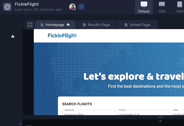
Switch media queries
This feature will help you visualize your website on different screen sizes. Just click on different tabs and check the responsiveness.
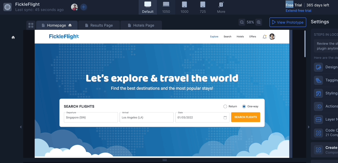
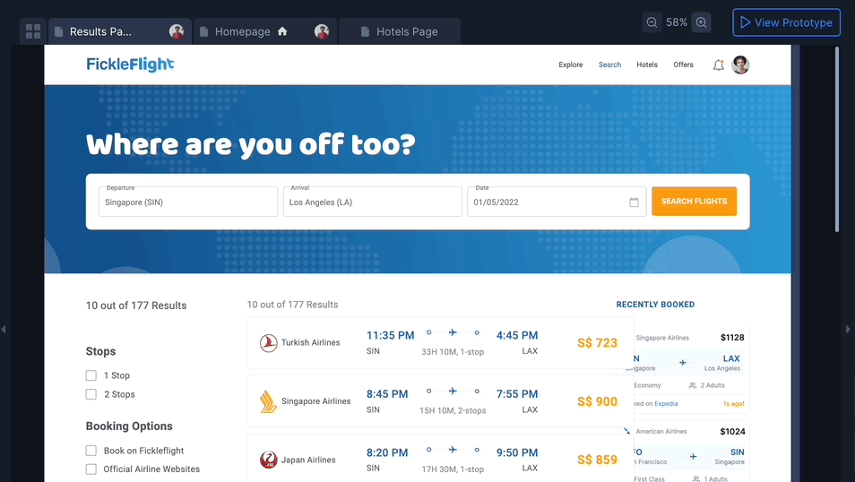
Preview Screen Panel
This section is where you view your design. What you see here is already running on live code. It has Live Preview, Screens Gallery, Page Navigation, Zoom feature and Prototype mode feature.
Live preview
- This is where your design is displayed. As it is running on code, what you see is exactly what you get. You can click on an element in the Viewer to select it.
- Selecting an element will reveal it in the Layers panel and show the available settings for it in the Settings Panel (Right side panel).
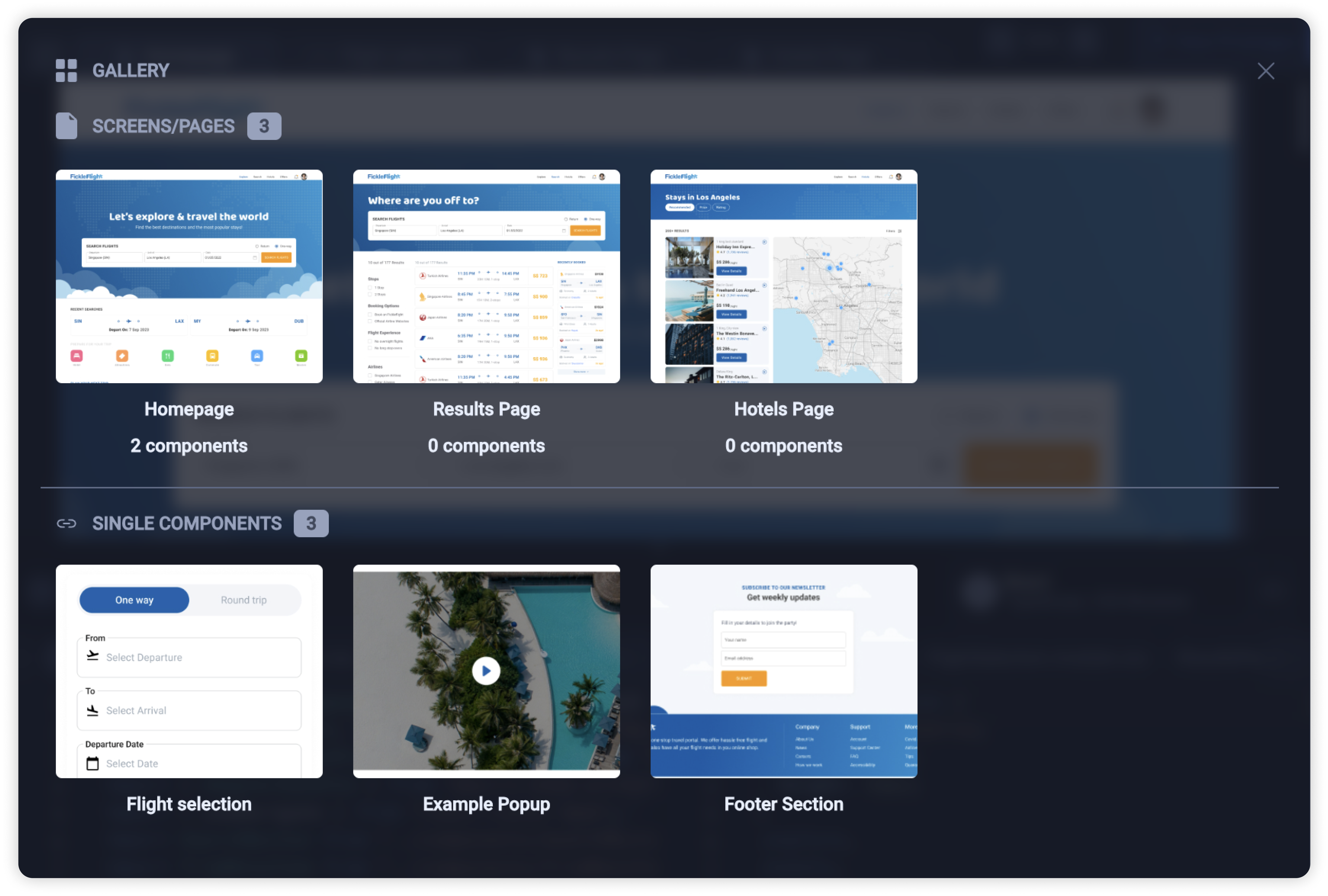
Screens Gallery
Select the four-squares icon in the top left to open the Screens Gallery. View all your screens and single components at one glance and select a tab to switch to it.
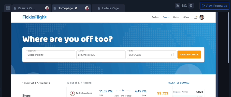
Page Navigation
Easily switch between different pages in your project using the dedicated tabs.
Zoom
Adjust the zoom level of the live preview.
Prototype mode
- Click on View prototype to navigate to the Prototype mode. Here you can preview how your final design will function with interactive elements.
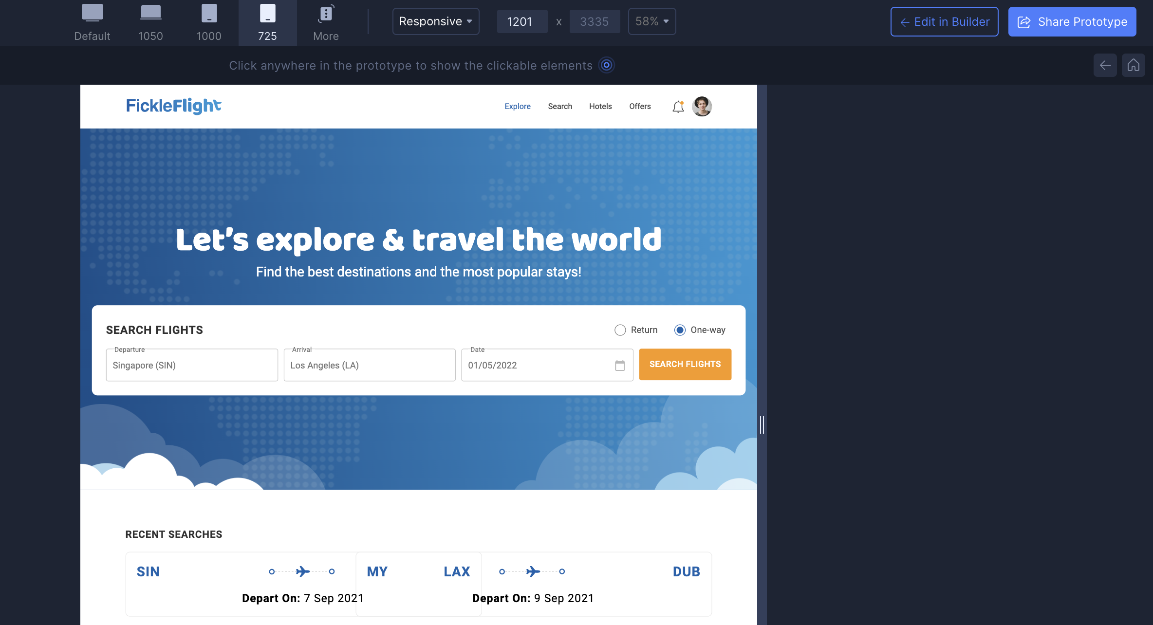
- You can also share the live preview to the respective stakeholders by click on Share prototype on the top right. You can diretly share the link or you can send via email.
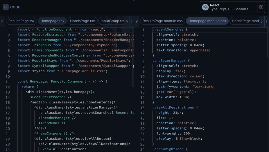
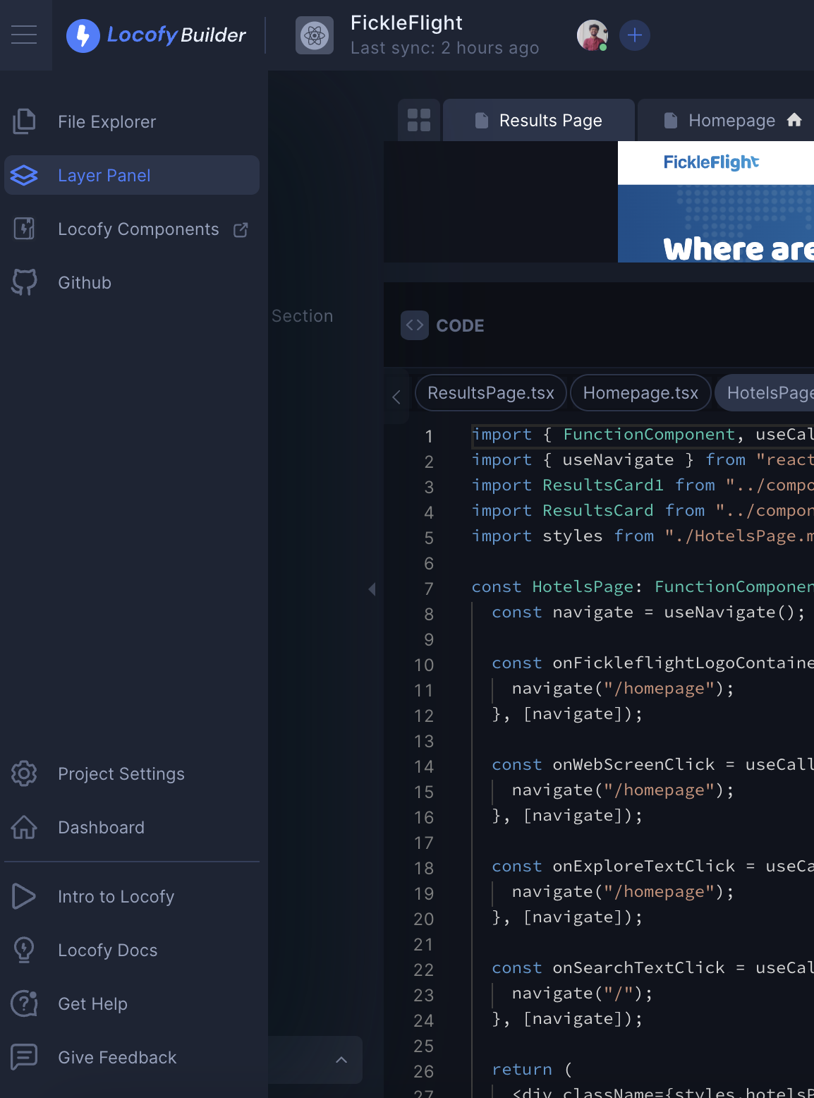
Code Viewer Panel
In this section you can you view the code behind your project. Also you can update your Framework settings from here.
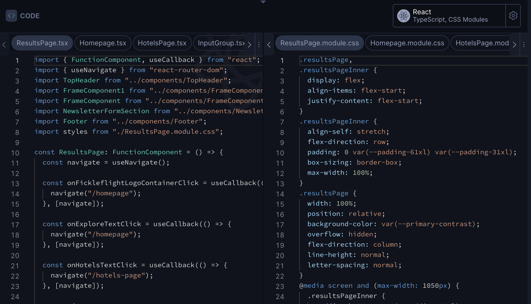
Code viewer
- This is where you can view the code and also switch between different files.
- You can also copy code snippets easily by hovering over the code viewer window and clicking the copy icon that appears on top right.
- On left side you'll see the js/ts code and left side you'll see the CSS code based on your framework configuration.
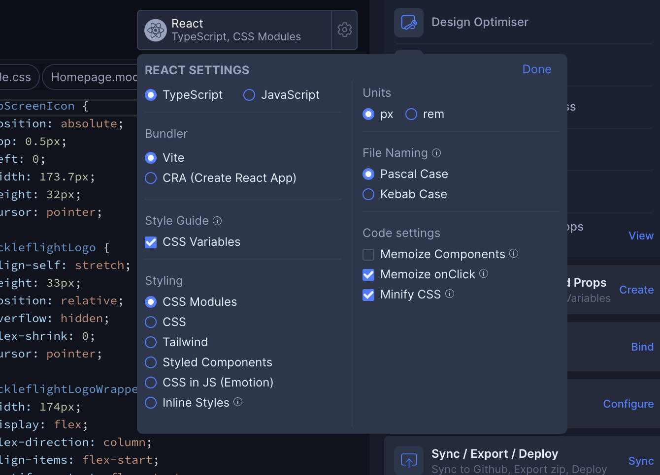
Framework settings
You can update your framework settings by clicking on top right putton in this section.
Left Side Panel
This is one of the most important panel where you'll see File explorer, Layer panel, Locofy component, Github sync and other Micelanious features
File explorer
- This is the view only code viewer, where you can edit the file names and manage the folder structure.
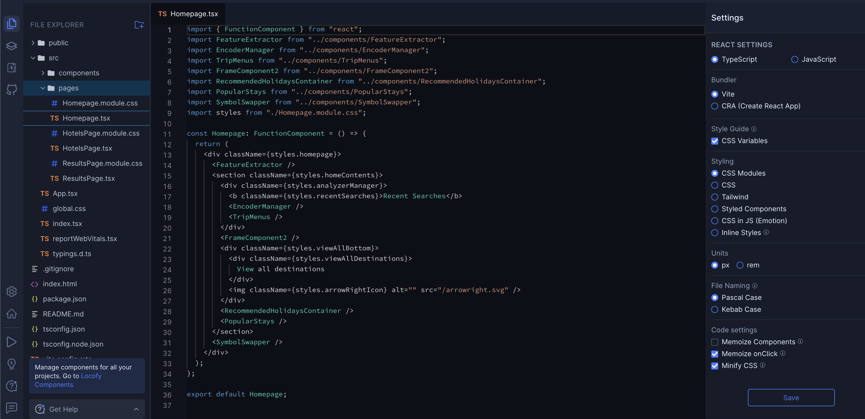
- On left side you can see the folder structure. When you hover over the file, you'll see the edit button. Click on it to edit the name of the file. You can also add folders and shift the files by dragging and dropping.
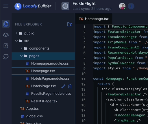
- On right side you'll see the Framework settings.
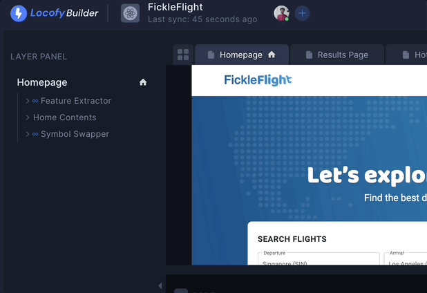
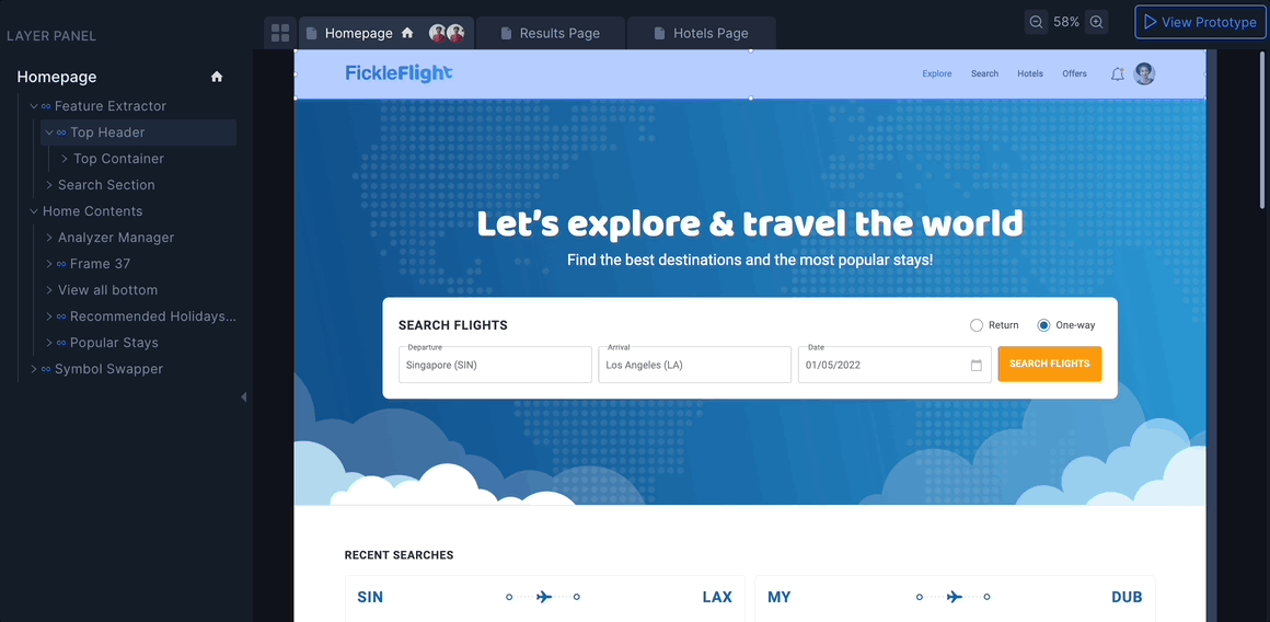
Layer panel
- The Layer panel provides a list view of all layers within your design.
- Clicking on a specific layer in the panel will highlight the corresponding layer in the live preview. Please check live preview documentation for your information.
- Layers representing components are denoted by an clip symbol before their name in the panel.
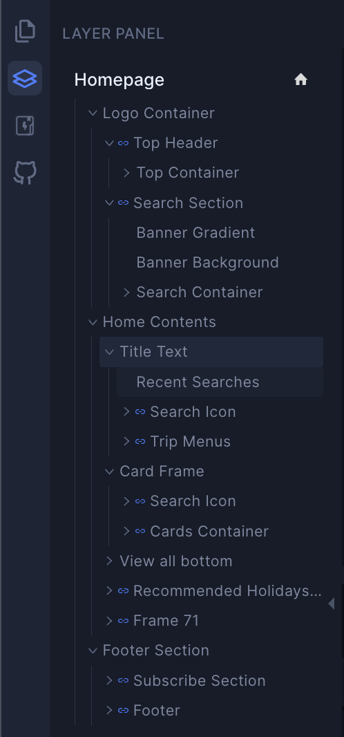
- The layer tree represents the structure of your design as it is in your Figma design. You can click an element in the layers panel to select it and highlight it on the Design Viewer.

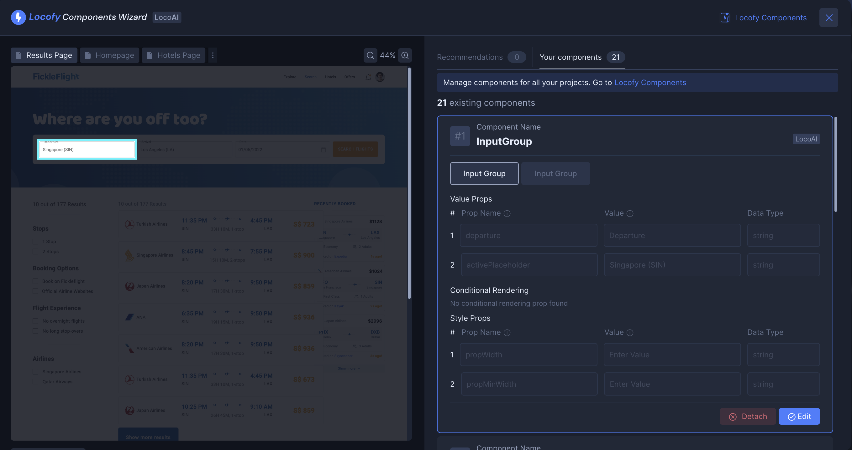
Locofy components
Clicking this button opens the Locofy component window, providing a centralized hub for managing and modifying all your Components and Props.
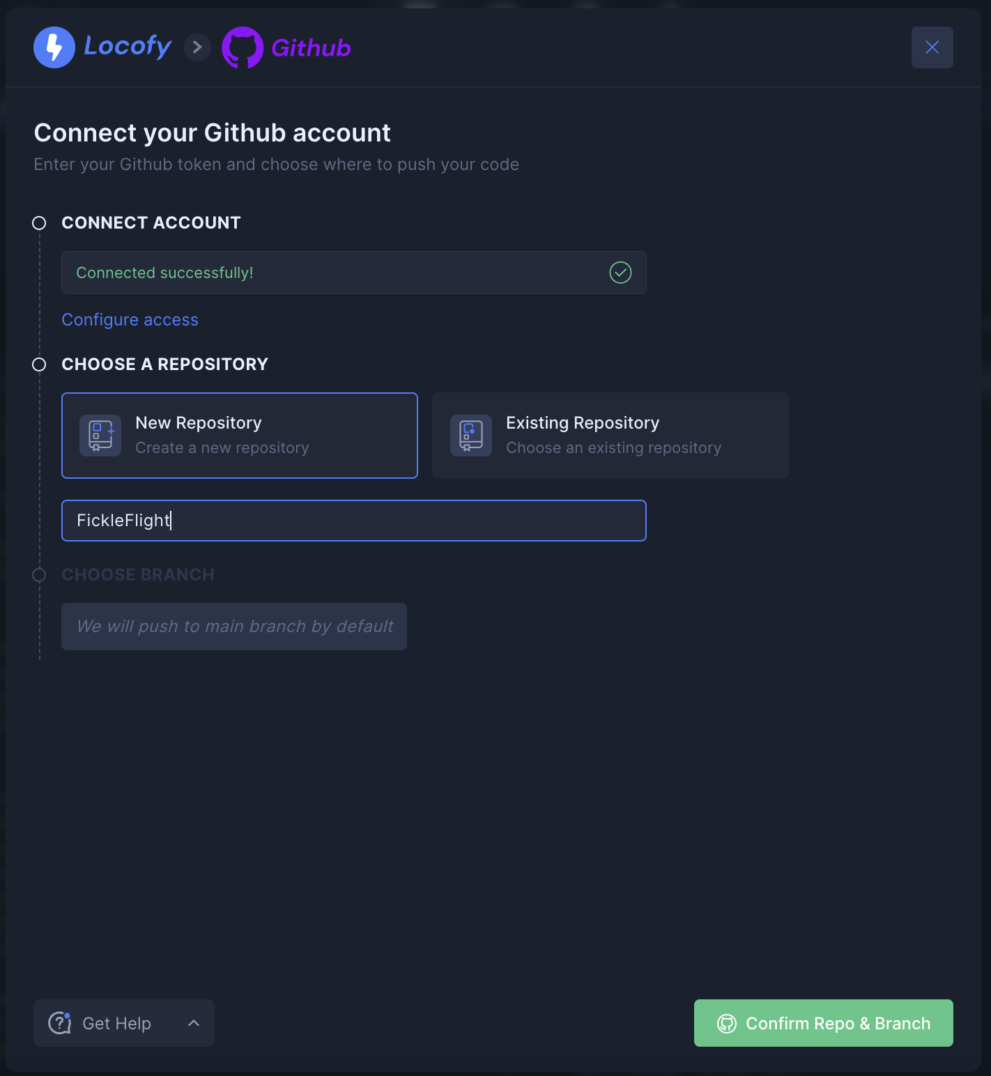
Github sync
- This will open up a Github sync modal and it will help you push your code to your Github repository.
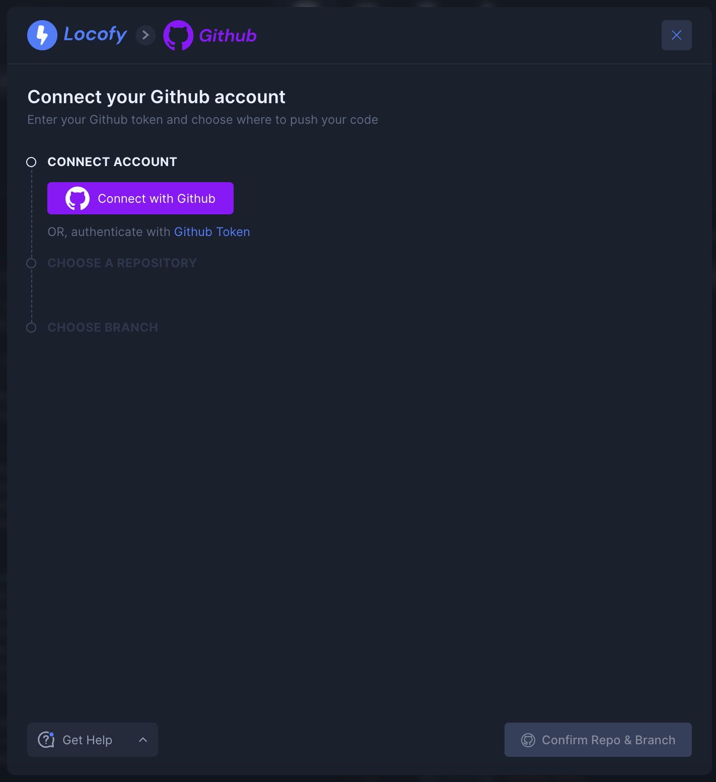
- The first step involves connecting your account to GitHub. Once connected, you can choose how to push your code. You can create a new repository or you can also push the code in the existing repository.
Right Side Panel
This is the settings panel that will help you manage Components, Configuration, Export, Deployments etc.
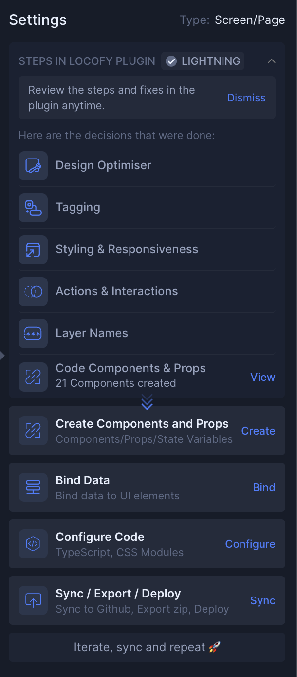
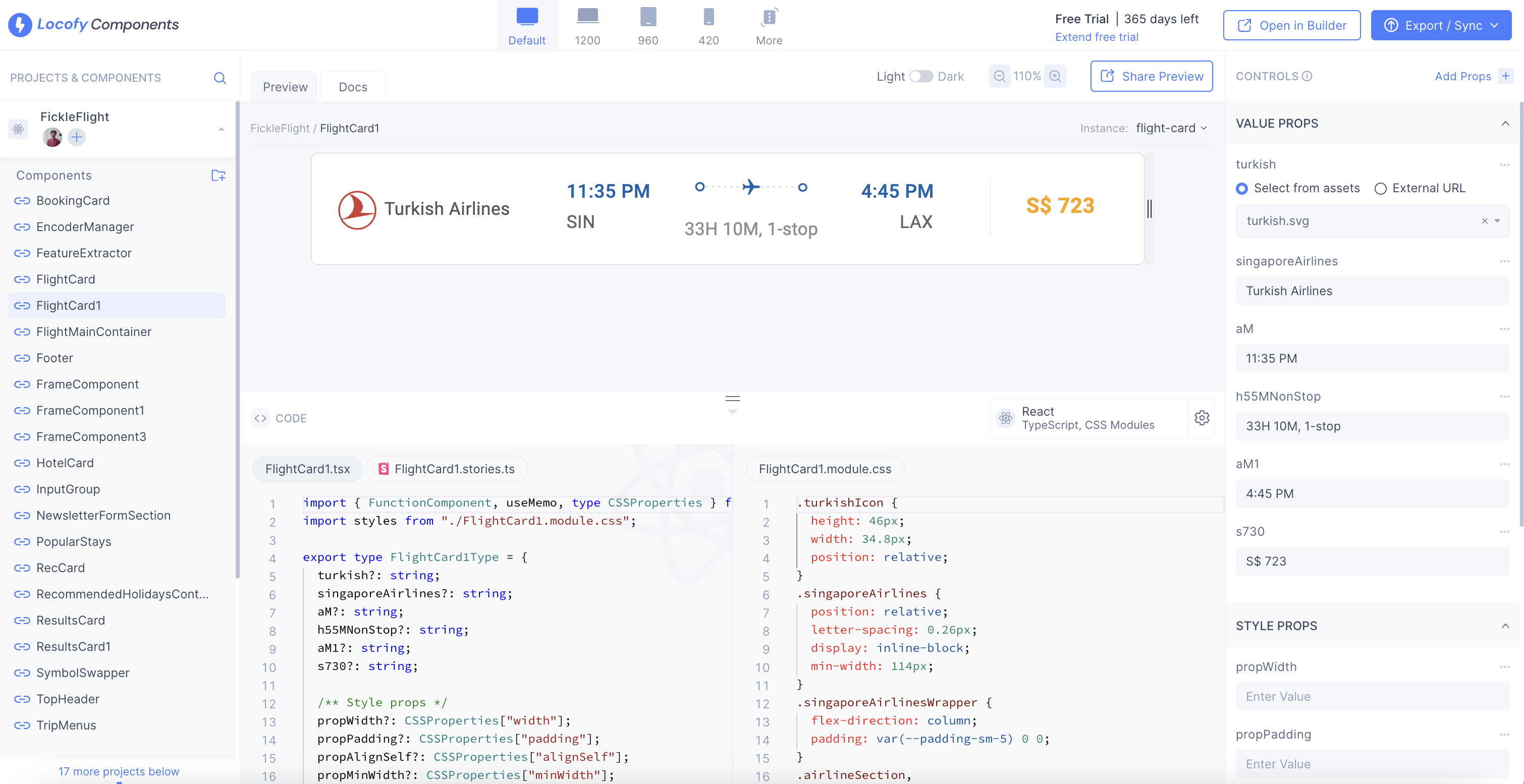
Code components and props
- Clicking on a code component opens the Locofy component wizard. This powerful tool allows you to edit the component's Instances, Props, and Name. You can also Detach a component from here.
- The wizard also has a Recommendations tab powered by LocoAI. This tab suggests optimal components that can improve the code quality.
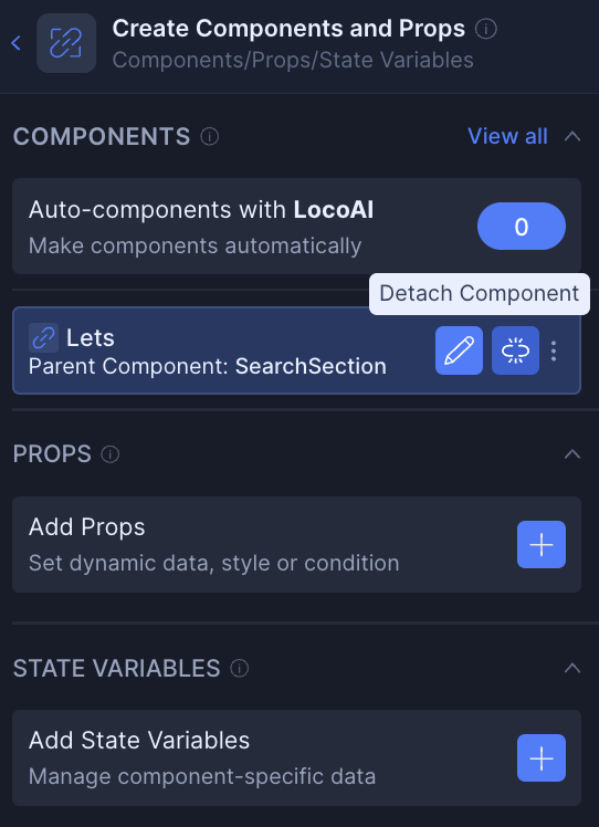
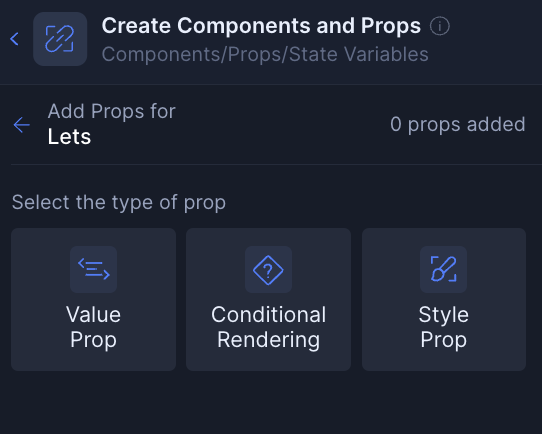
Create components and props
- To create a component in Builder, start by selecting the layer you want to convert into code within the live preview.
- Once you've chosen the layer, you'll see options in the right-hand side panel for both creating a component and adding props.
- The create component section consists of 3 sub-sections: Components, Props, and State Variables.
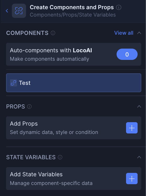
Components
For your selected element, you can convert it to a new component or into an existing component.
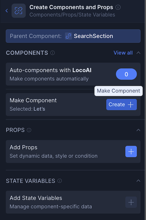
You can also convert it from a component back into a normal element by detaching.
Props
You can add props to your selected component. Currently you are able to add value and style props for dynamic data and styles, and also set up props for conditional rendering of any elements.
State variables
You can add also state variables to your selected component. Currently you are able to choose among different types namely String, Number, Boolean, Object, and Array. You can also select the scope of the variable. Please refer the Data bindng (opens in a new tab) documentation to learn more.
Bind data
The data binding feature is used to easily integrate dynamic data with Locofy-generated code. Please refer the Data bindng (opens in a new tab) documentation to learn more.
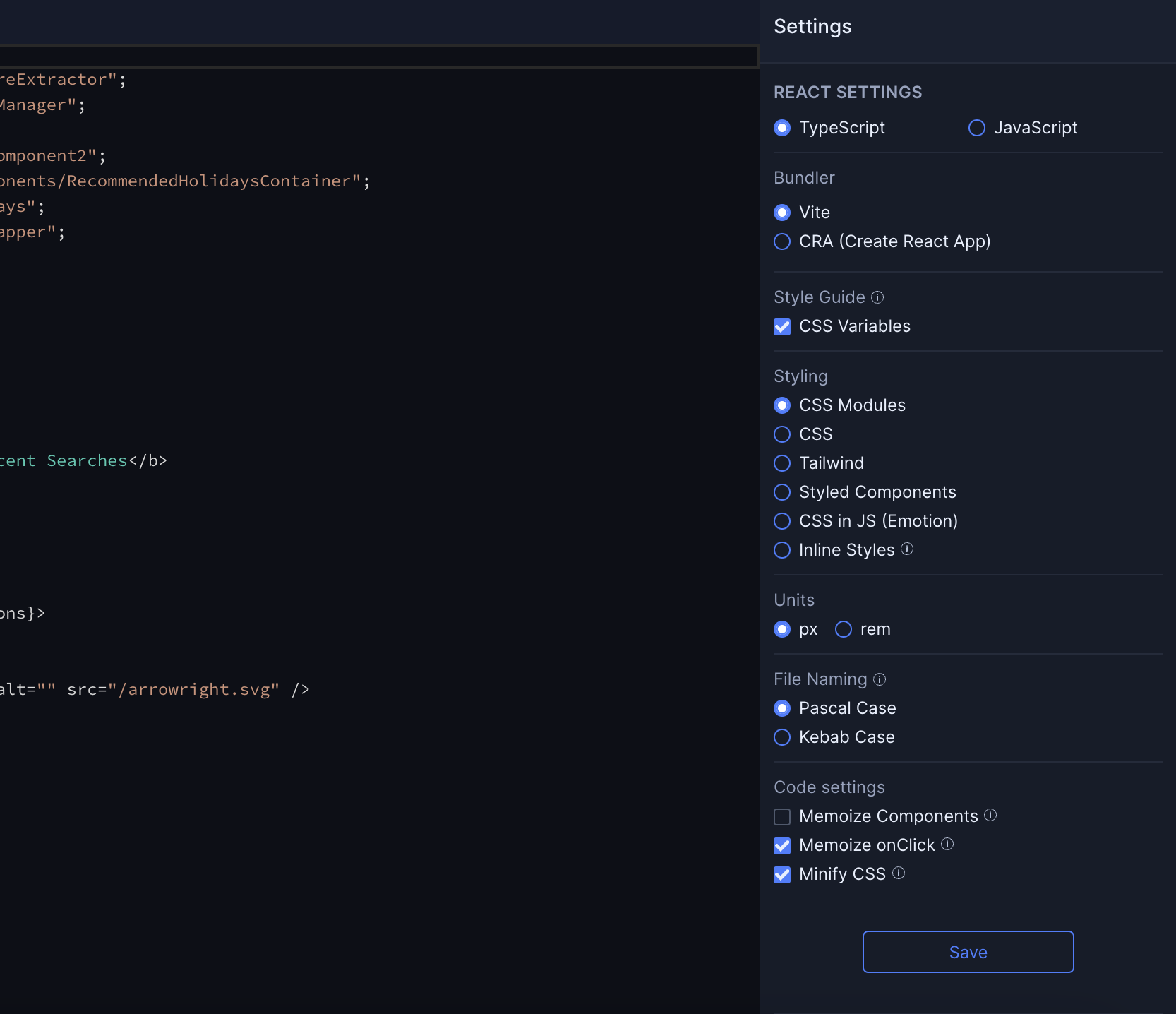
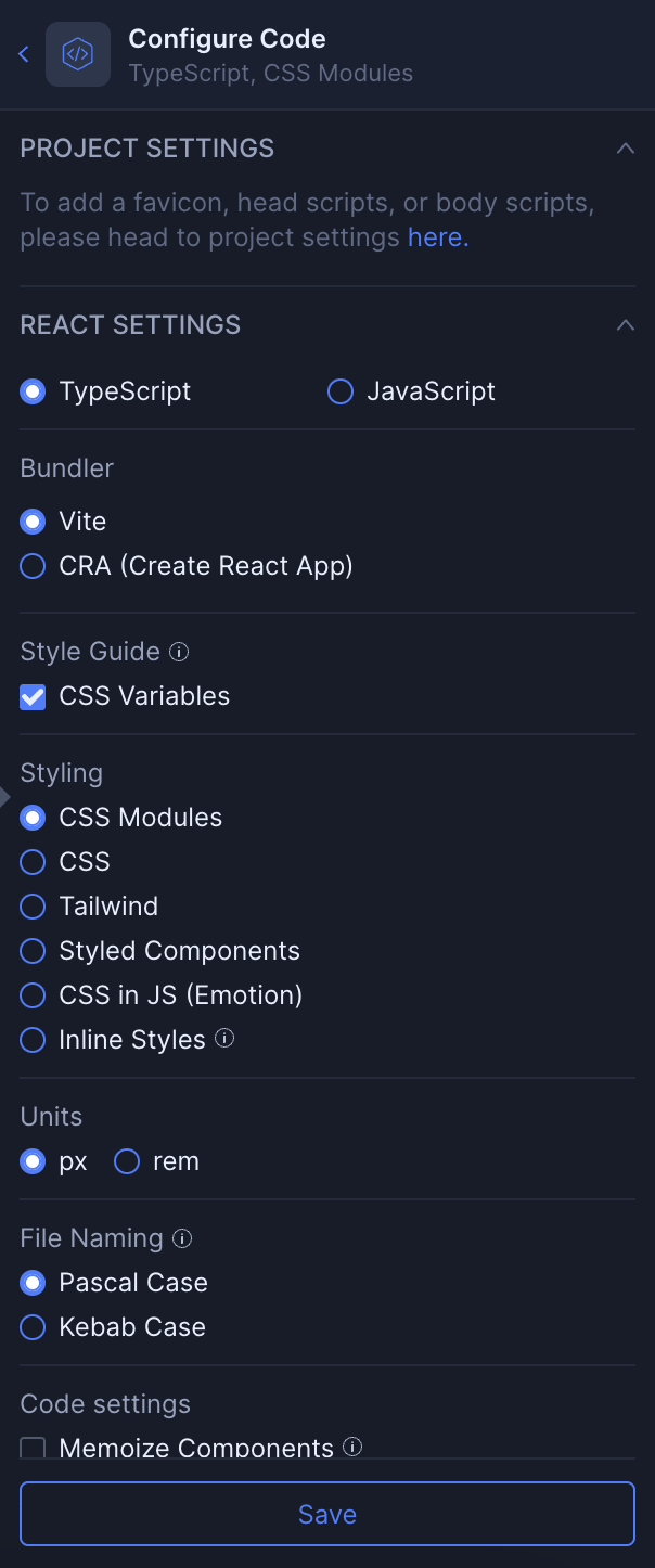
Configure code
In this section you can change the Framework settings. You can modify settings related to Bundling, Styling, Units, File naming, and other code-related settings.
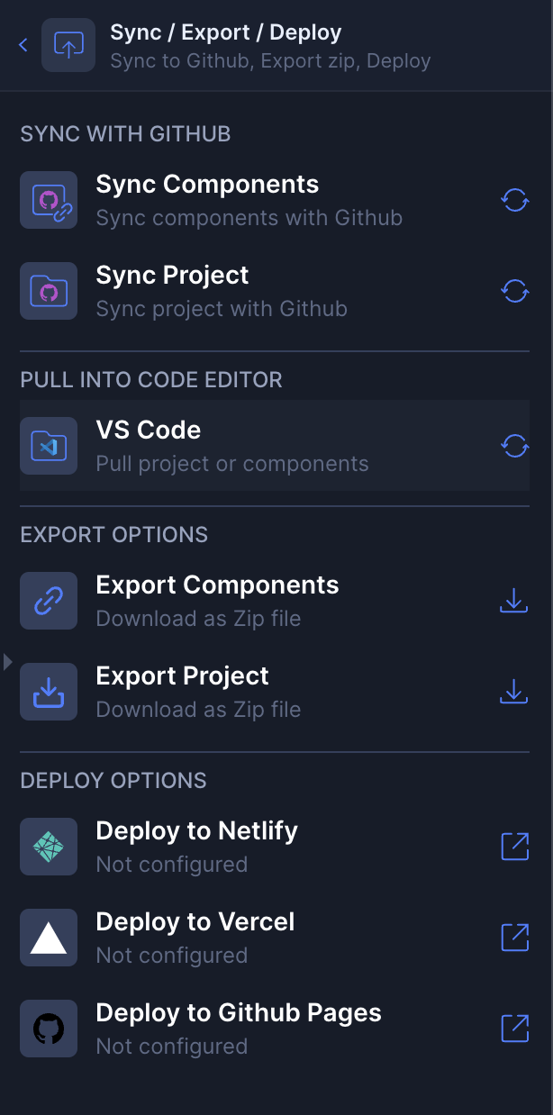
Sync / Export / Deploy
This section will allow you to:
- Sync with Github: You can either sync the project or you can also sync the components with your Github repository. Refer to the documentation here (opens in a new tab) for detailed information.
- Pull the code to VS code: Clicking on it will take you to the guide (opens in a new tab). In this guide will walk you through the process of setting up the Locofy VS code extension and pulling your builder code directly into your VS code in minutes.
- Export options: You can export your entire project or specific components as needed. Refer to the documentation here (opens in a new tab) for detailed information about export
- Deploy options: Deploy your finalized projects to popular platforms like Netlify, Vercel and Github pages diretly from the locofy builder. Refer to the documentation here (opens in a new tab) for detailed information.