Define layout on different screen sizes
Use our Design Optimiser to adjust the layout of your design at each screen width to ensure it looks great on different screen sizes
Introduction to Adjusting your Design Layout for Different Screen Sizes
This is the only fix in the third section of the Design Optimiser which helps you to adjust your design layout for different screen sizes, by letting you change the stacking direction at different screen widths.
Do note that this fix is only applicable for Web frameworks such as React, Vue, NextJS, Gatsby and HTML-CSS. This fix is not available in Mobile frameworks like React Native.
Applying Fix
After completing the previous steps, your screen is now responsive. However, there may be cases where your design still breaks down and you need to change the layout on smaller devices. This fix detects and assists you to handle such cases.
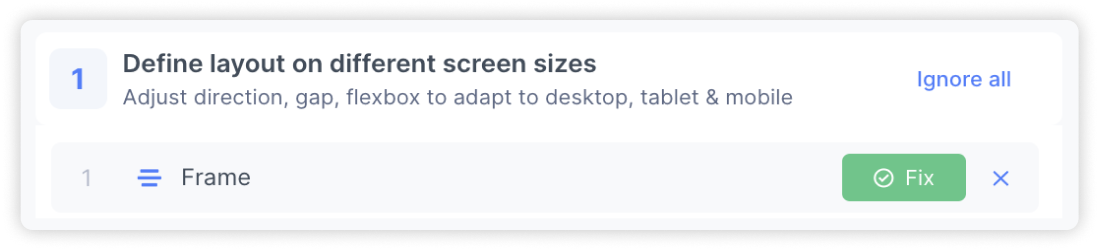
Applying the fix: Click the ‘Fix’ button to open up the fixing panel
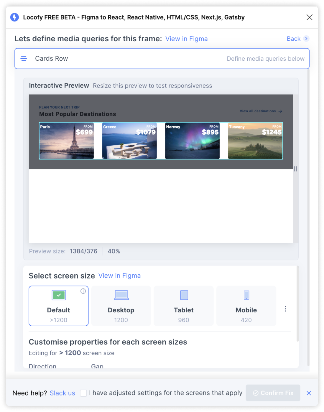
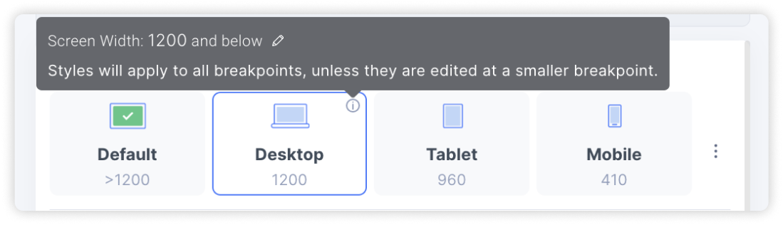
Screen size tabs: Click on the tabs to preview your design at the different screen widths. To change the screen width, hover over the tooltip and click on the pencil edit icon to modify the media query screen size
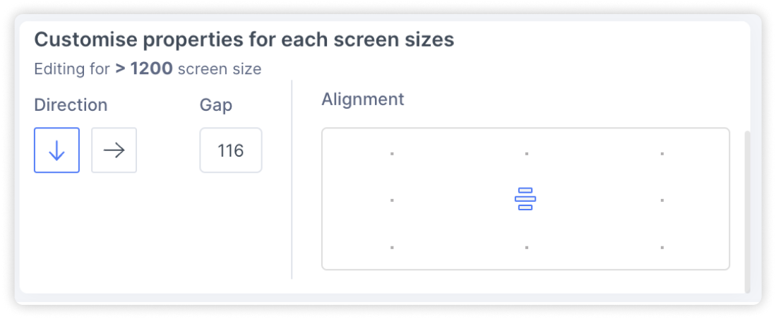
Customising properties: At each screen size, you can change the stacking direction for the elements, the gap spacing between elements and the alignment. This let’s you adjust the layout of your design for different screen widths.
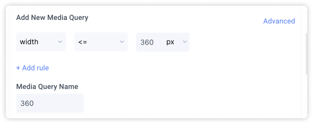
Adding new custom screen sizes: To add new custom screen sizes, select the icon with the 3 dots. Then, define your new media query and assign it a name for easy reference.
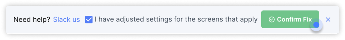
Confirm fix: Once you have checked the preview and are happy with the settings applied, select the checkbox to indicate that you’ve adjusted your design for all the different screen sizes. Then, click on ‘Confirm Fix’